30 Day Logo Challenge
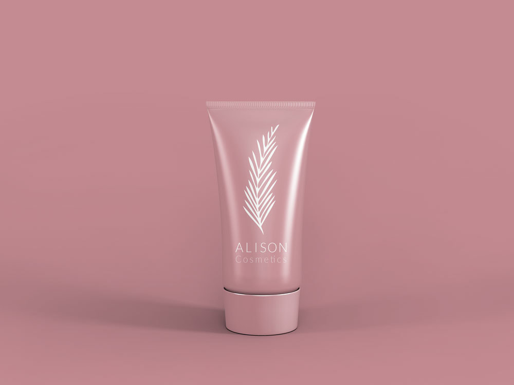
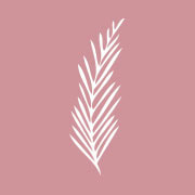
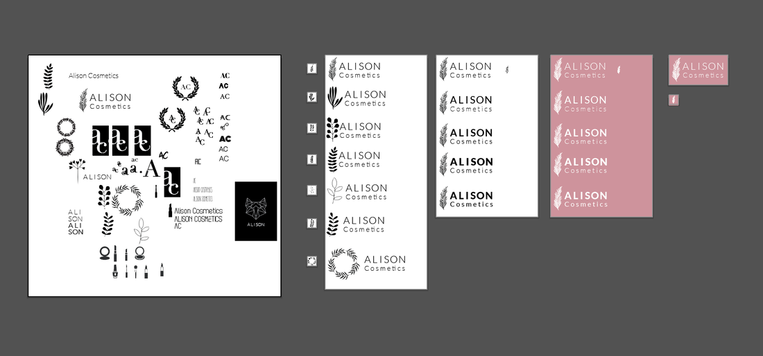
01. Alison CosmeticsOnline beauty store.
Asks
Brand
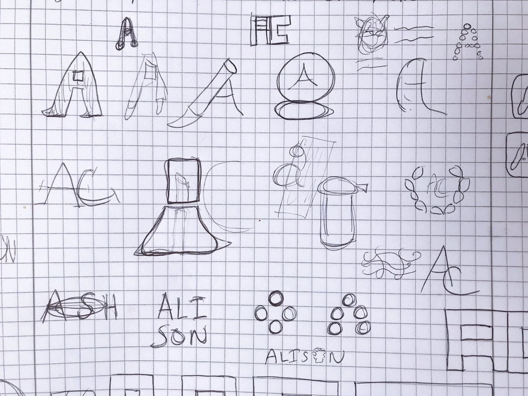
Solution Soft without script type became my focus. After sketching a full page of ideas working off the 'A' I decided to go in a different direction. 'Vegan' stuck out to me and made me think of natural, organic, etc. I moved in that direction with exploring the idea of natural and soft. Flora and fauna came to mind and eventually I chose a hand drawn leaf/branch for the icon part of the logo. Paired with it is the clean sans serif typeface Lato in Light and Thin. I used the light weights of the typeface as a way to keep the type feeling soft without using a hand drawn typeface that would have felt to homogeneous and uninteresting. |
Design manager Tookie making sure everything is going smoothly
|

|
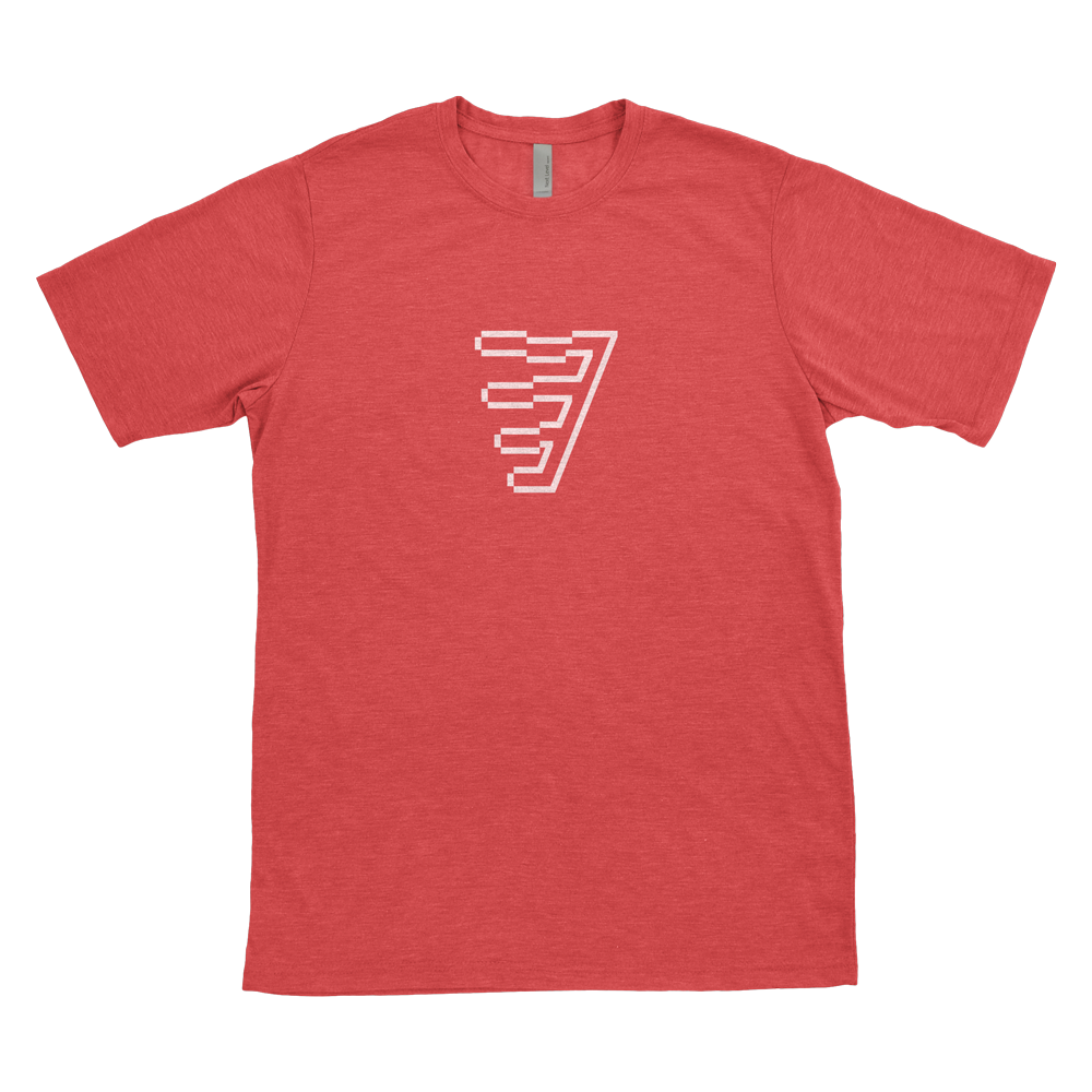
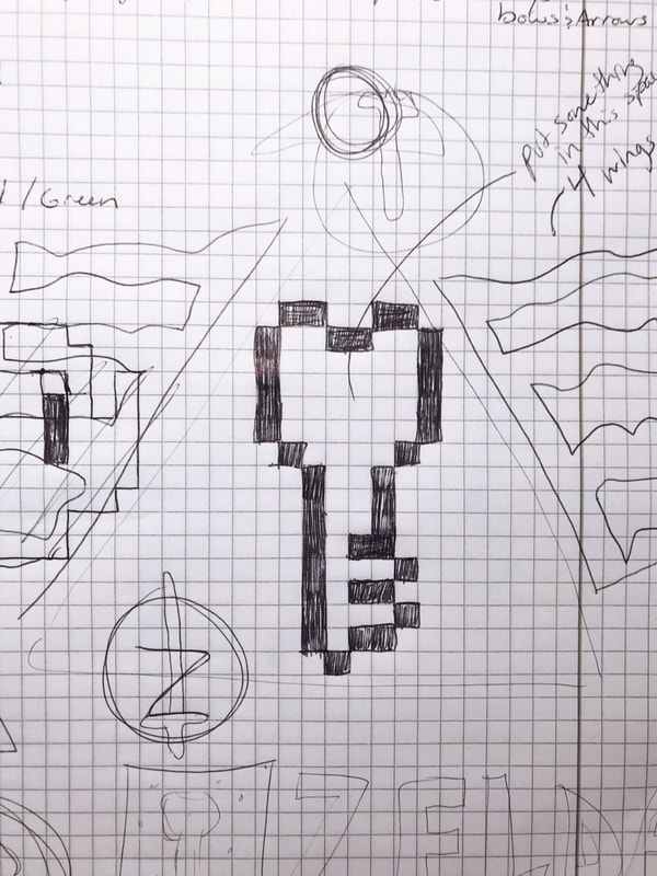
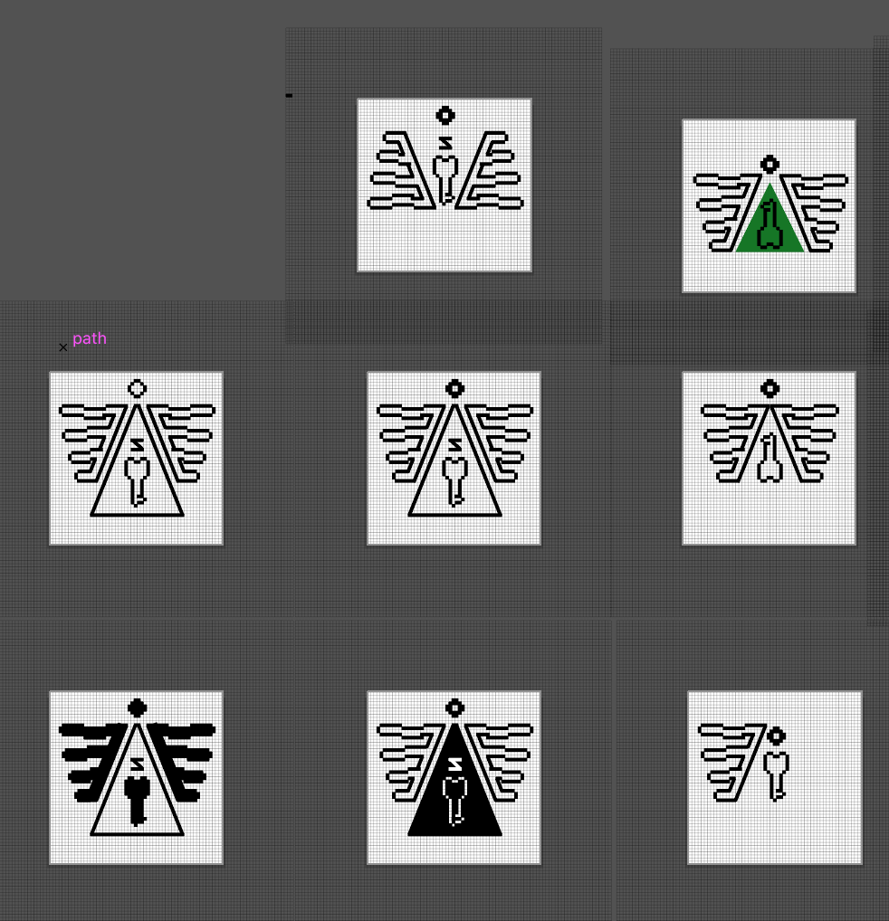
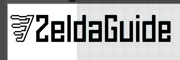
02. ZeldaGuideSmall publisher of videos, articles, and community events around Legend of Zelda games.
Asks
Brand
Solution Since I haven't played Zelda since the 80's I started this design by making a list of Zelda words like: sword, shield, key, adventure, puzzle, princess, 8 bit, pixel, etc. One strong memory I have from Zelda is of a pixelated key. So I sketched that out. I noticed the 3-triangles symbol is used a lot so I added a triangle around it. Looking at Link's shield, I noticed a pixel bird, so I added the wings and the head to my key-triangle sketch. I made a bunch of different versions of this idea and didn't like any of them. But, I felt like the left wing could stand alone as an icon. So, I grabbed it and created the company name in the same pixel look. As soon as I flipped the type color to the stroke, everything looked coherent. Zelda colors seem to be red, gold, and green. So, I grabbed a red and toned it down a bit for the brand. |
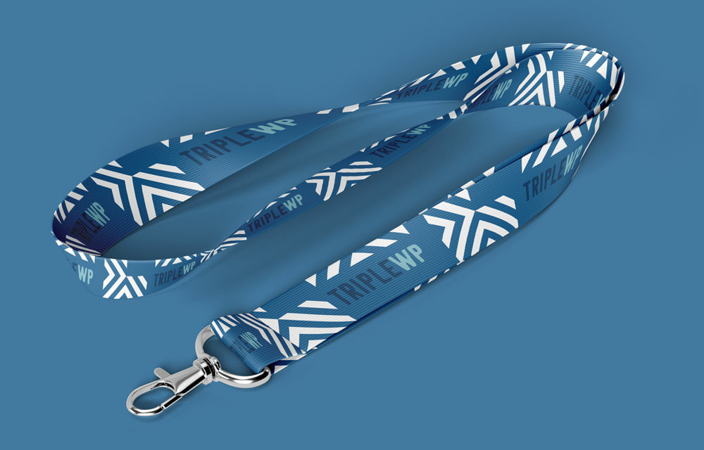
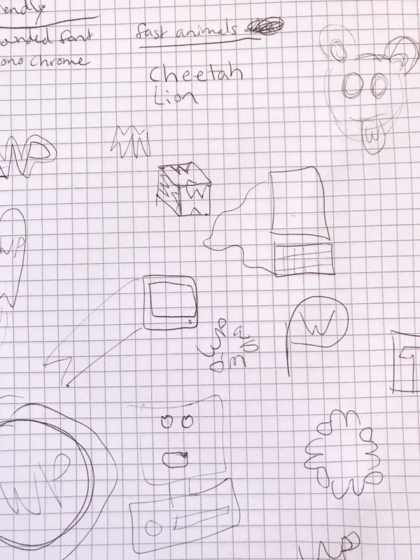
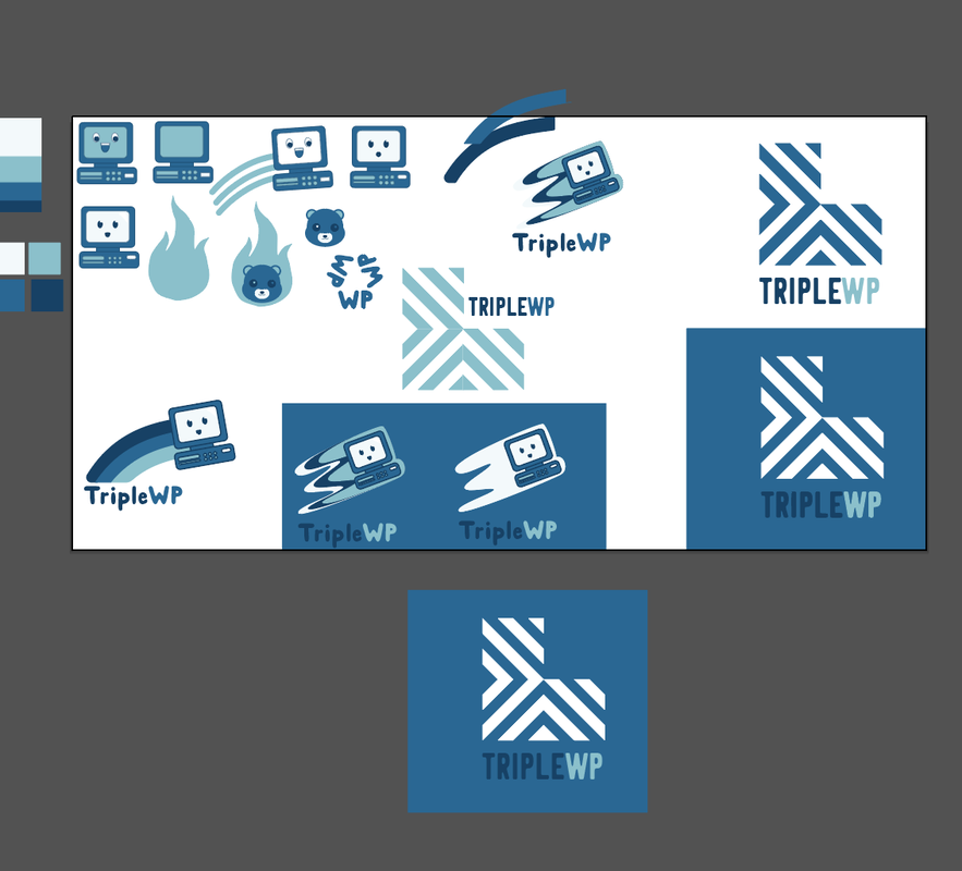
03. TripleWPStartup that simplifies the user experience of developing a website within Wordpress making it three times faster than the traditional method of writing code.
Asks
Brand
Solution I first focused on friendly, speed, and computers. With those words in mind, I sketched out some ideas for a happy computer that had some speed lines. I played around with the idea of a cheetah as an icon but neither of those concepts were panning out and the line between friendly and cutesy had been crossed to a point where I wasn't comfortable continuing on that path. So, I shifted my focus to something more abstract. Repeating the lines of the 'W' and cropping into a box, reflecting content boxes of web design. Then I copied that box to create 3, a visual representation of 'Triple'. It wasn't exciting enough when the 3 boxes were all stacked on top of each other so I went with two boxes sided by side creating a solid foundation and one on top. I chose a typeface that was rounded but not handwritten. It has a friendly, approachable appearance without being too casual and I stuck with a blues and white for color as black felt very harsh. |
|
|
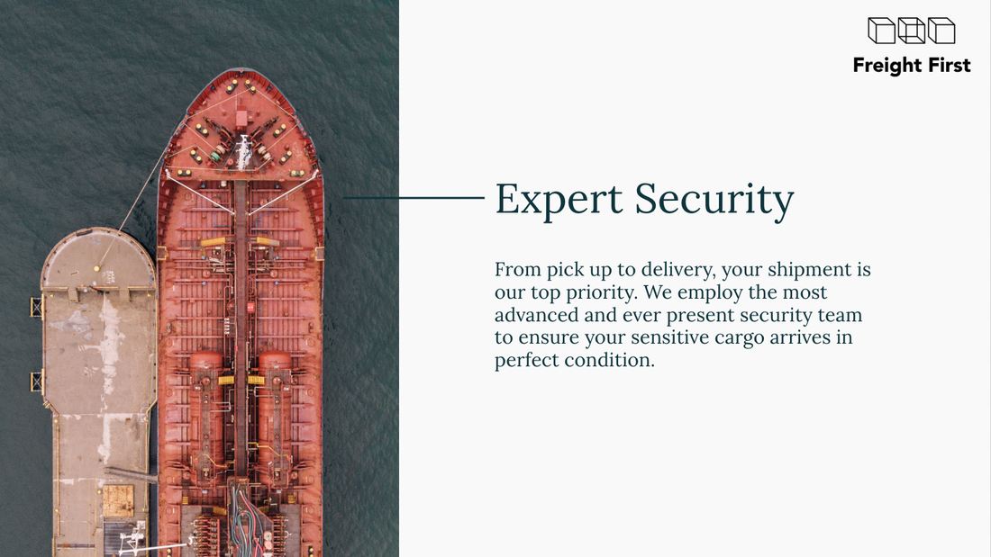
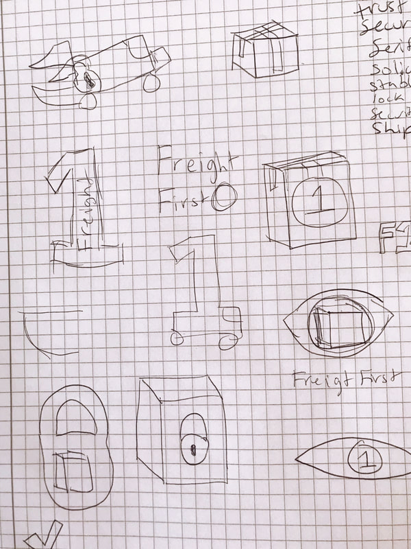
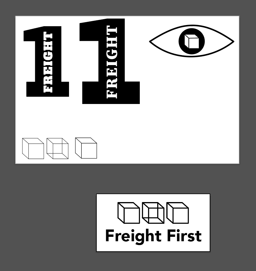
04. Freight FirstIntermediary freight broker between shippers and trucking companies specializing in optimal routes for sensitive cargo.
Asks
Brand
Solution The no nonsense ask for this logo led me to my first idea of the number 1, large, with 'Freight' within it. It would be bold and direct, not colorful or extravagant. But, as I began creating revisions for it, I thought it lacked something that I couldn't quite place my finger on. So, I moved on to another idea, an eye with a box for a pupil. I want to blend their 'trust' and 'security' key words with something freight-like. As I made different versions of the box, I sat them next to each other and noticed how simple and pleasant they looked and decided to move in that direction. |
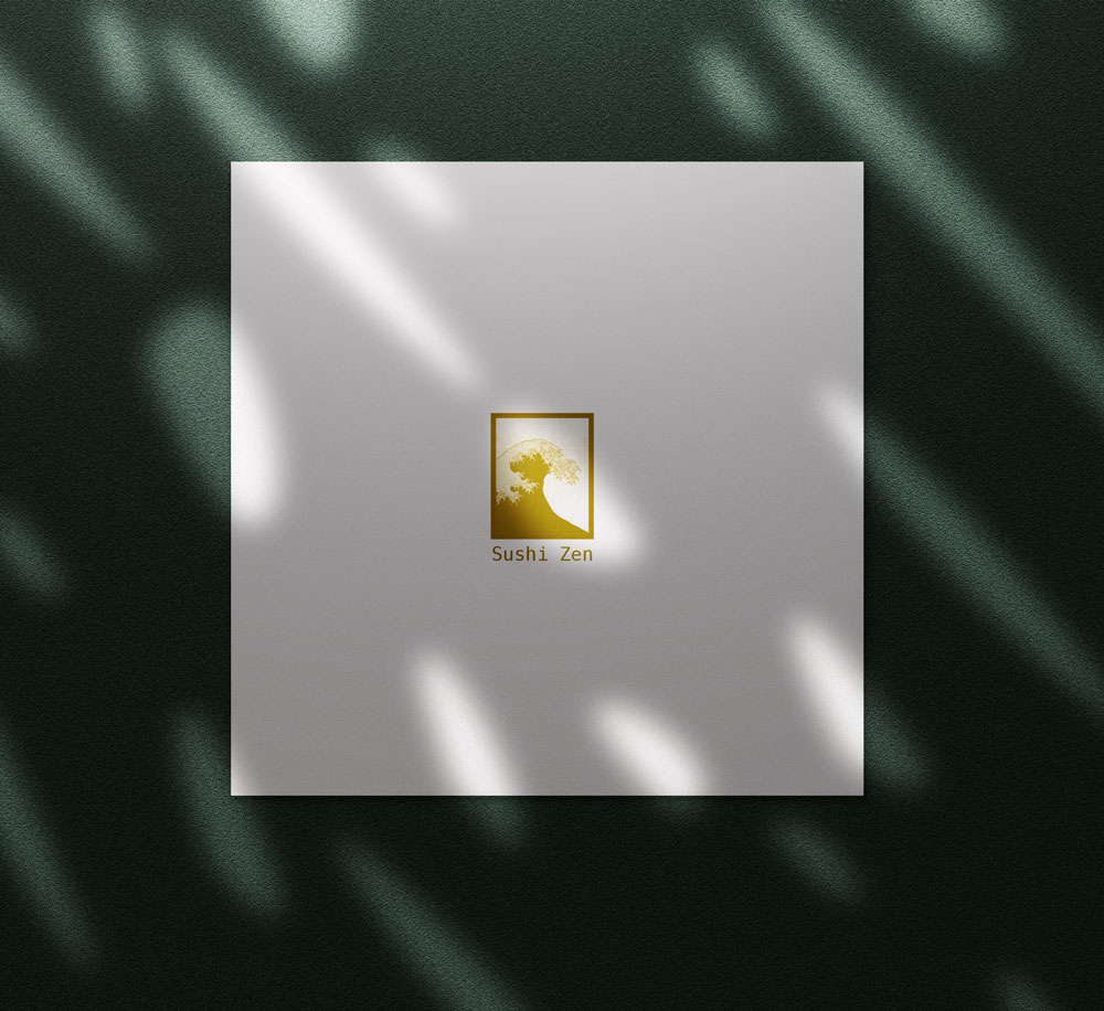
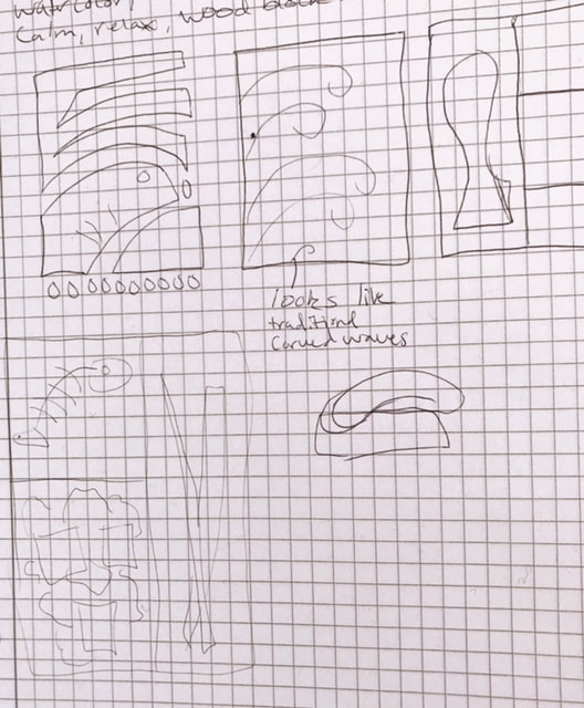
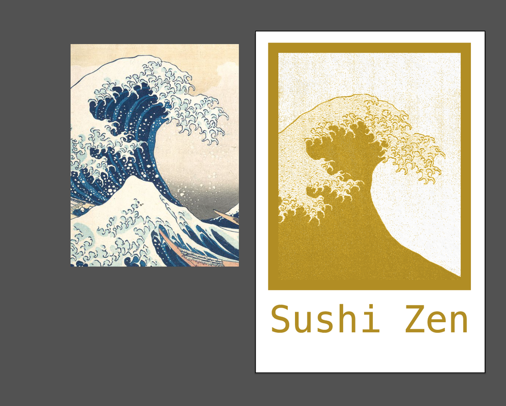
05. Sushi ZenSmall sushi restaurant.
Asks
Brand
Solution Sushi on it's own tends be an expensive meal. It doesn't matter if the restaurant itself is fancy. The nature of sushi generally makes it a higher priced item than most other types of food. I wanted to bring that high priced feel into my design. My first instinct after making a list of sushi terms was to create a stamp-like logo reminiscent of a bento box. But, after re-reading the brand details, I changed direction. A bento box style logo seemed too cheap for a small (exclusive), critically acclaimed restaurant focused on quality and tradition. I had sketched the classic wave so famous from ancient Japanese wood block carvings and decided to have that be the focus of my 'stamp'. After painting it in photoshop, I added a wood texture to make it look more organic and printed. Every Japanese restaurant I can think of has the black, white, and red color palette. I decided this restaurant needed something more rich. Sushi Zen is not your average everyday sushi restaurant. So, I went with gold for the logo, that can be paired with a deep green, and white. The menu is square and simple. The gold logo is stamped on the back, when turned over, there's a simple one-paged printed menu on the front. |
|
|
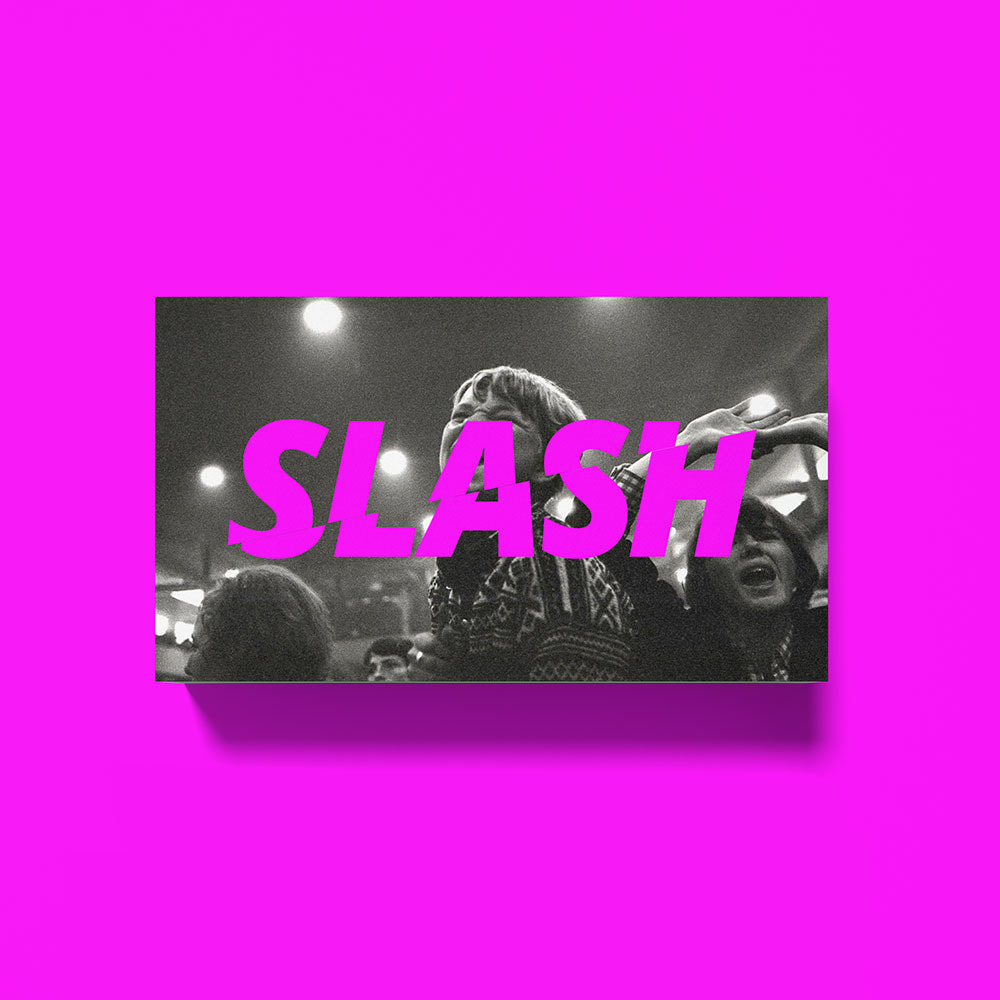
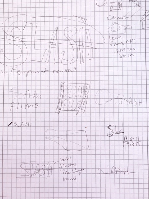
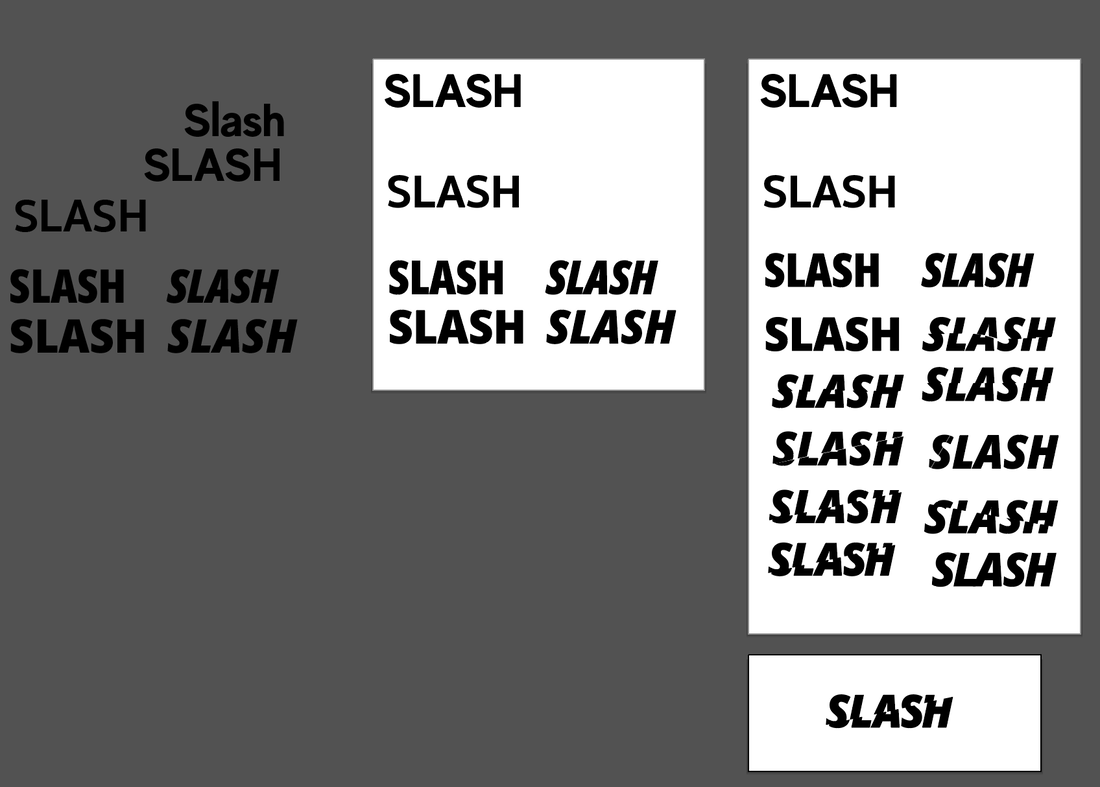
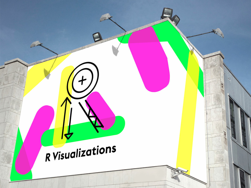
06. Slash FilmsCompany that provides camera equipment and props to film crews.
Asks
Solution Rental companies see a lot of movement. They have items coming and going, there's an aspect of chaos to that kind of business. I wanted to incorporate that movement into their logo so I literally slashed their name. To keep clear of the violent or gore-y side, I chose a pinkish-purple color high in saturation. It gives the brand an almost band-like quality. I envision them painting their gear boxes that color so whenever their equipment is being used on a set, you see the pile of pink. Imagery of film reels and clapboards seemed to cheesy, so for their business card, I overlayed their logo on top of a cinematic image. Using a service like Moo.com you can choose many different images and have a variety of business cards. They could easily use stills from movies they've rented equipment to and show their reach.
|
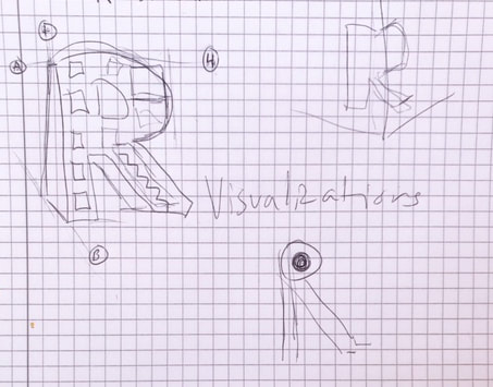
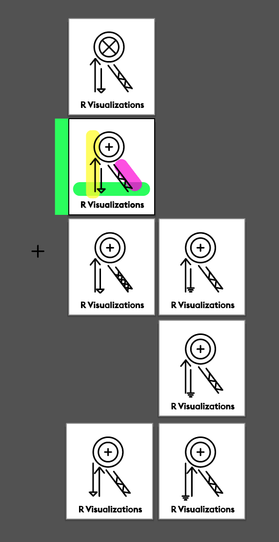
07. R VisualizationsPhotorealistic architecture visualization firm that offers engineering services.
Asks
Brand
Solution This company is so 3D focused that I my first instinct was to create a 3D 'R' as their icon. I worked on a couple of ways to do that but nothing looked right. The 3D building 'R', too childlike, the wrap-around a wall 'R', too over done and made me think of a publishing house. So, I looked up symbols used on architecture engineering drawings and used them to build an 'R'. I knew this concept lacked that 3D specialty they wanted to show off so I added some pops of color to the background. It doesn't scream 3D but shows dimension. I focused on bright colors for the background to evoke fresh ideas and creativity. After sleeping on it, the shapes and colors I used really remind me of 23andme.
|
|
|
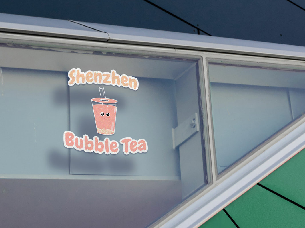
08. Shenzhen Bubble TeaBubble Tea beverage kiosks.
Asks
Brand
Solution Since they wanted a bubble tea Icon, I made that my priority. With my limited illustration skills, I did my best to create a friendly and happy looking bubble tea icon to stick to their brand. After that, I found a bubbly font that was legible at a distance and offset it from the background with a white cloud effect. It isn't my favorite logo. I would prefer the strokes on the bubble tea to match the bubbly-ness of the type but ran out of time. 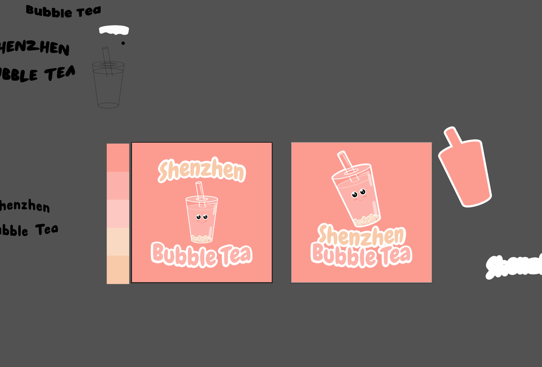
|
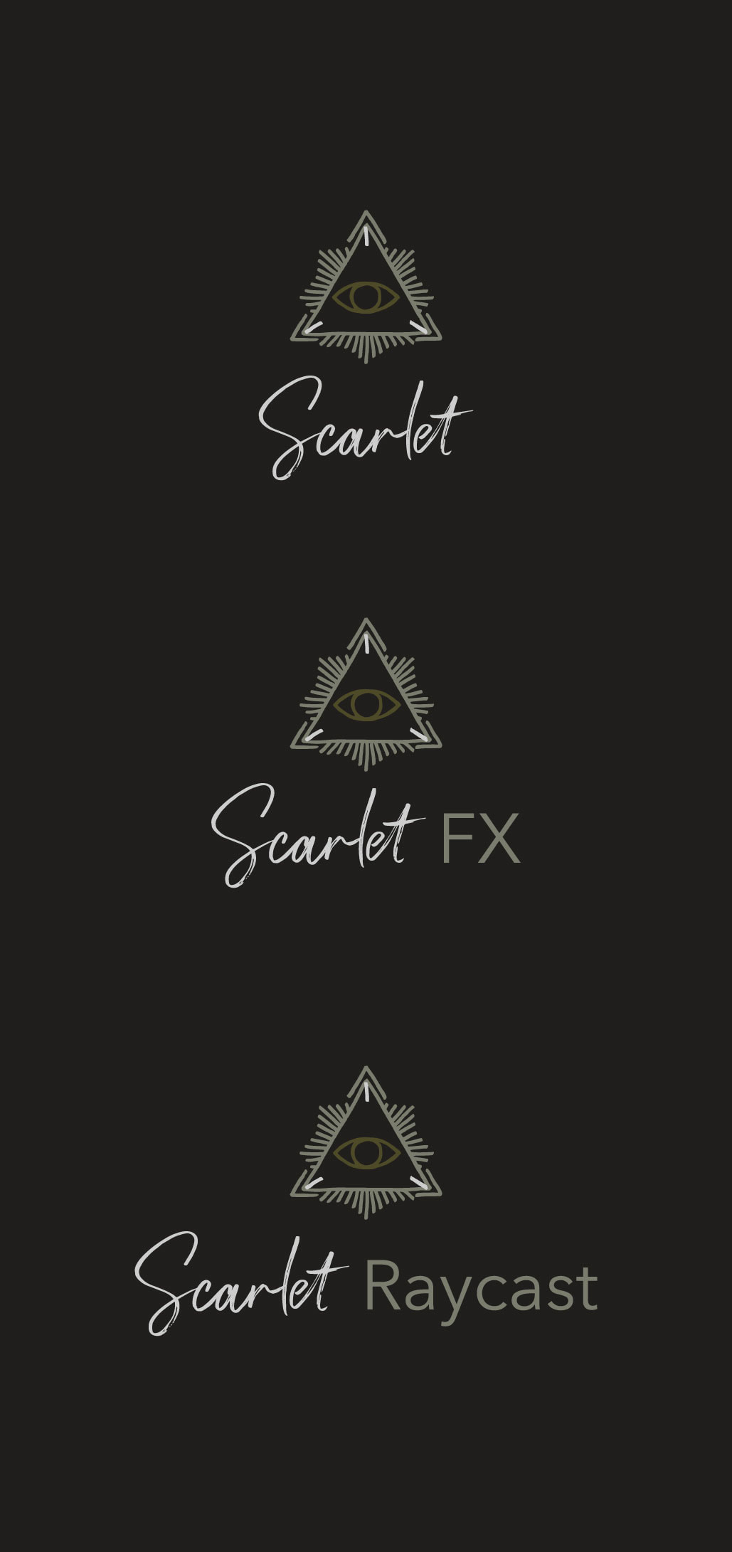
09. ScarletSoftware development and visual effects.
Asks
Brand
Solution Since this logo needed a design system, I focused on that first. With that in mind I had two design systems I thought would work and began on the first. I searched for two very different typefaces; one needed to carry the emotion of the brand and the other needed to be all business. After I found that pairing, I decided to add an icon. I found this icon by accident in a pre-made set. Usually I wouldn't use a pre-made icon for a logo challenge but since I spent the majority of my time on the design system for the logo, I felt it was ok to use a pre-made icon. For the colorway, I grabbed colors from their provided image and kept the hip-tech feel using those browns, warm grays, and greens. 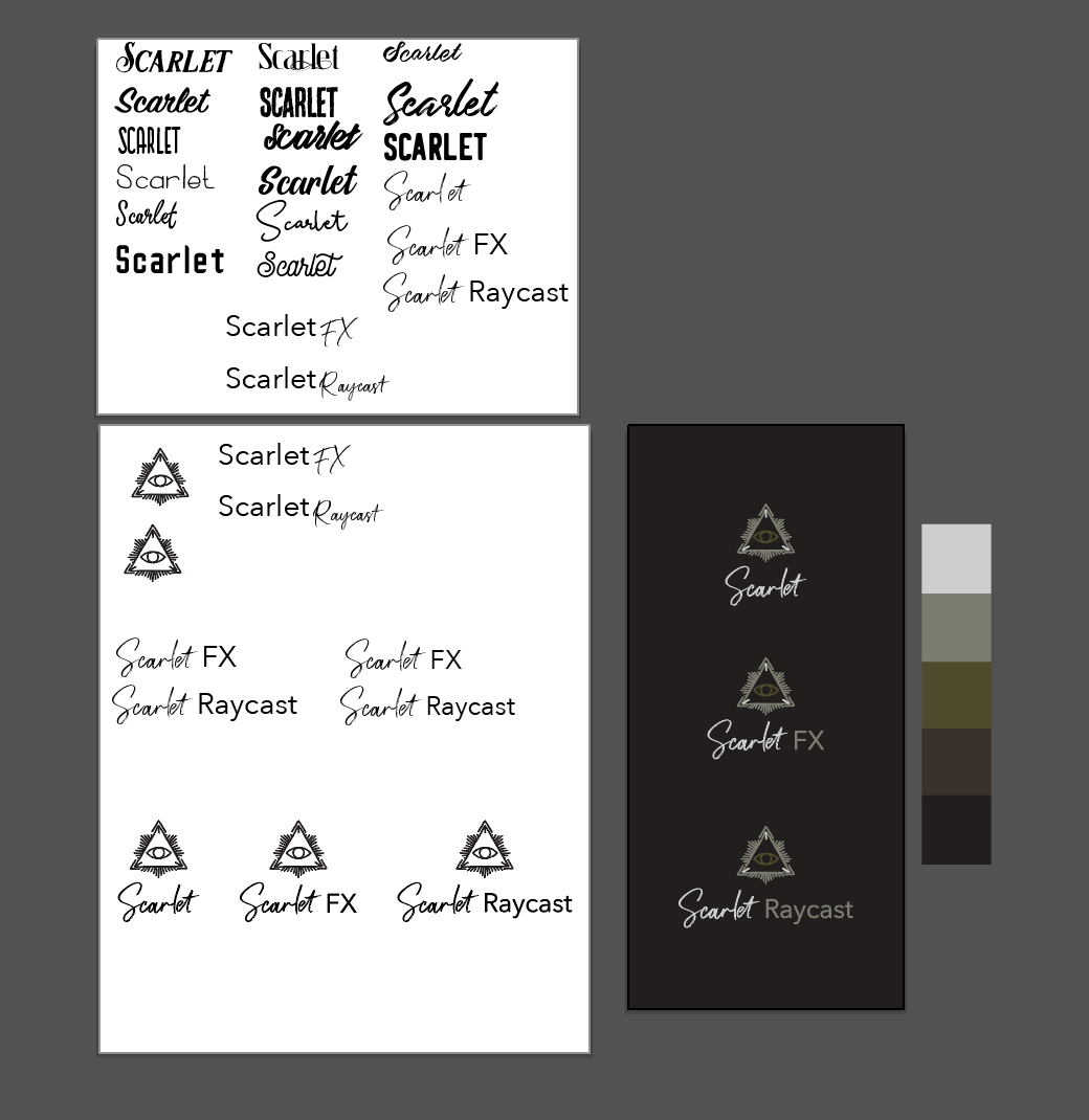
|
|
|
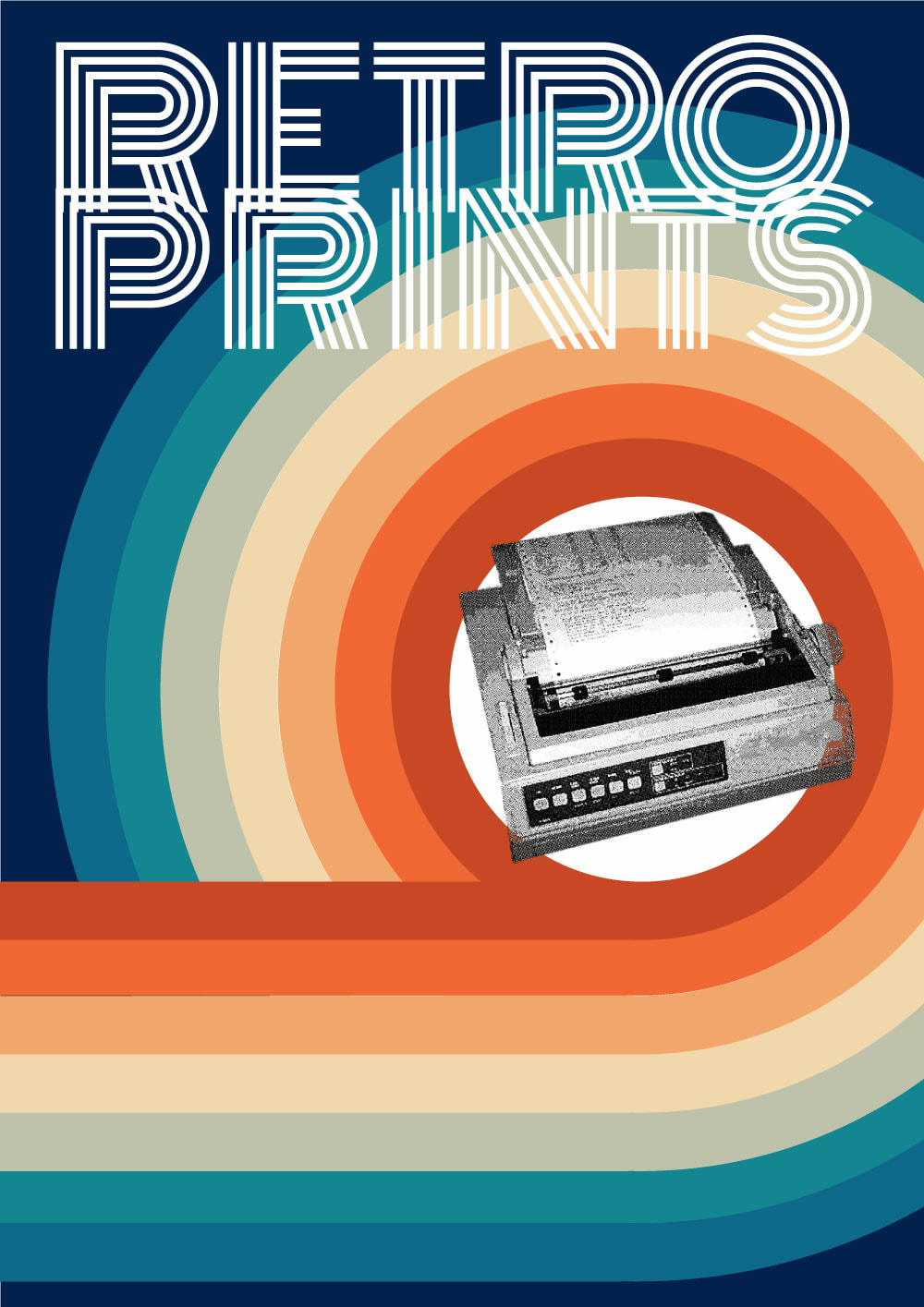
10. Retro PrintsSmall printing house that sells limited edition poster prints and merchandise of classic films and comics.
Asks
Brand
Solution Vintage poster design, food packaging design, etc is a passion of mine. It made this logo extremely hard for me to design. I wanted to go in a million different directions (and I did). Nothing felt 'good enough' or 'right' and even what I settled on still doesn't look that great to me. If it weren't a 24 hour challenge, I would have kept exploring ideas for this. But, for the sake of time, I settled on a simple word mark a la the Mexician Olympics. It looked graphic enough to me to stand alone and retro enough to be paired with color and imagery. 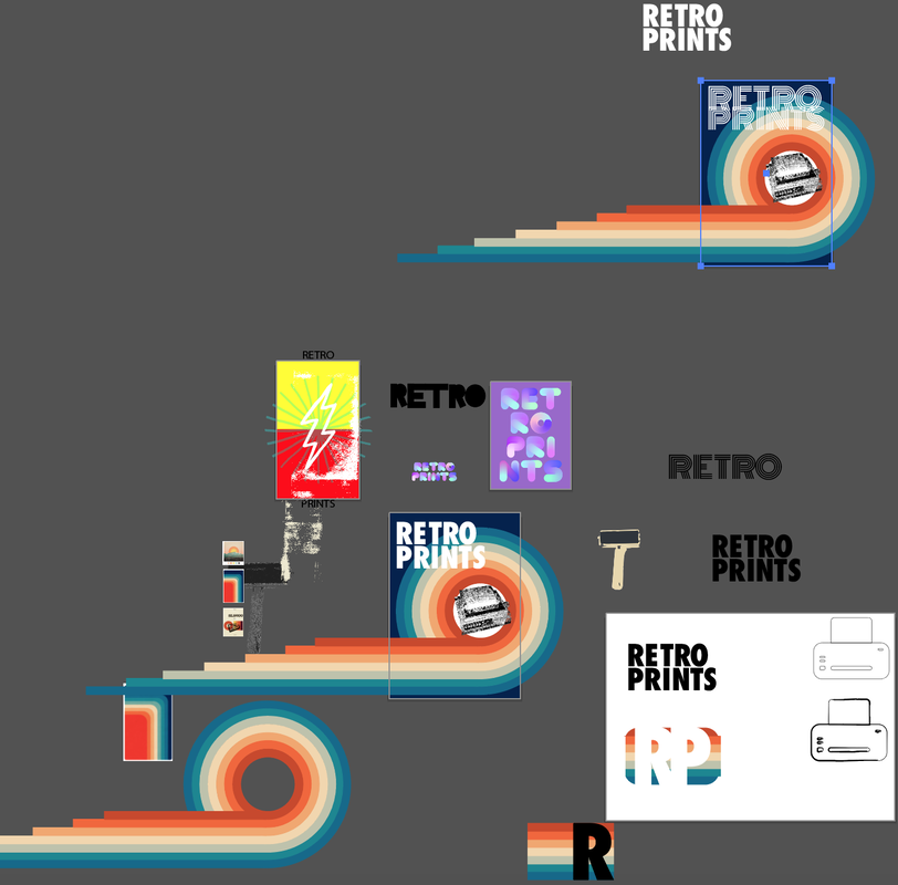
|
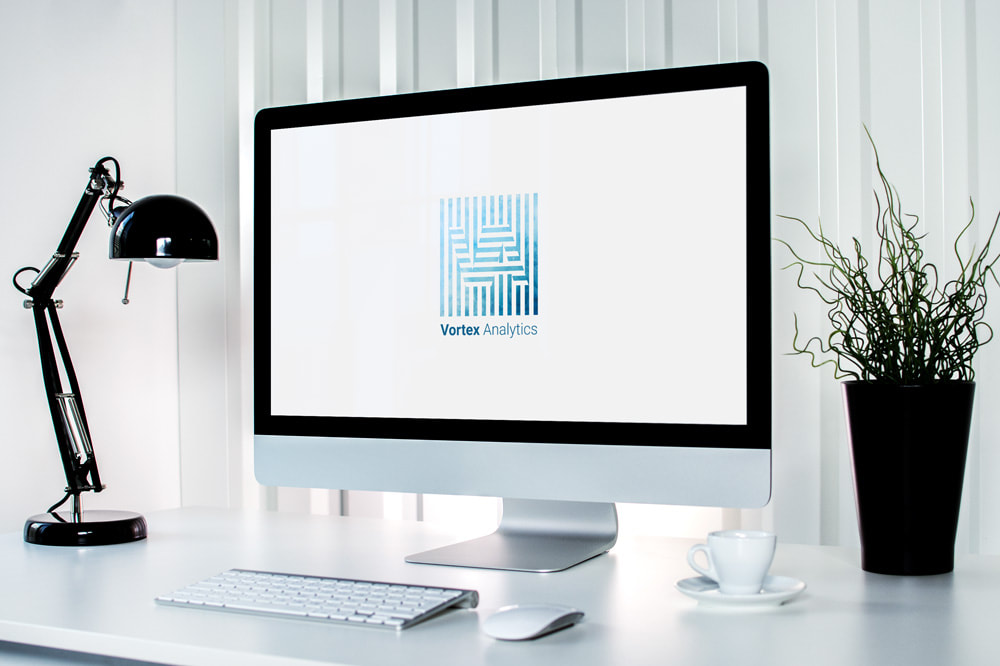
11. Vortex AnalyticsModern big data analytics company.
Asks
Brand
Solution Having a set typeface for this helped me to quickly move to working on the mark. I clarity and ease of use are a bit difficult to convey without crossing into an elementary look. So, I instead focused on a mark that showed the streams of data, which can overwhelm but through that, easily you can make out the 'VA'. Just like their service allows you to sift through data to see the bigger picture. For clarity, I have the logo against a white background but show how it can look cloudy over a gradient. It could be a great animated visual, the logo emerging into focus and clarity from a gradient background. 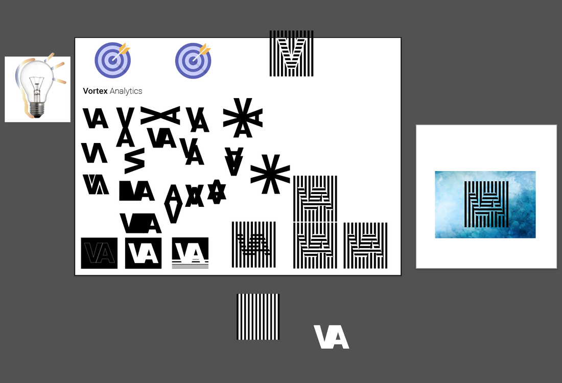
|
|
|
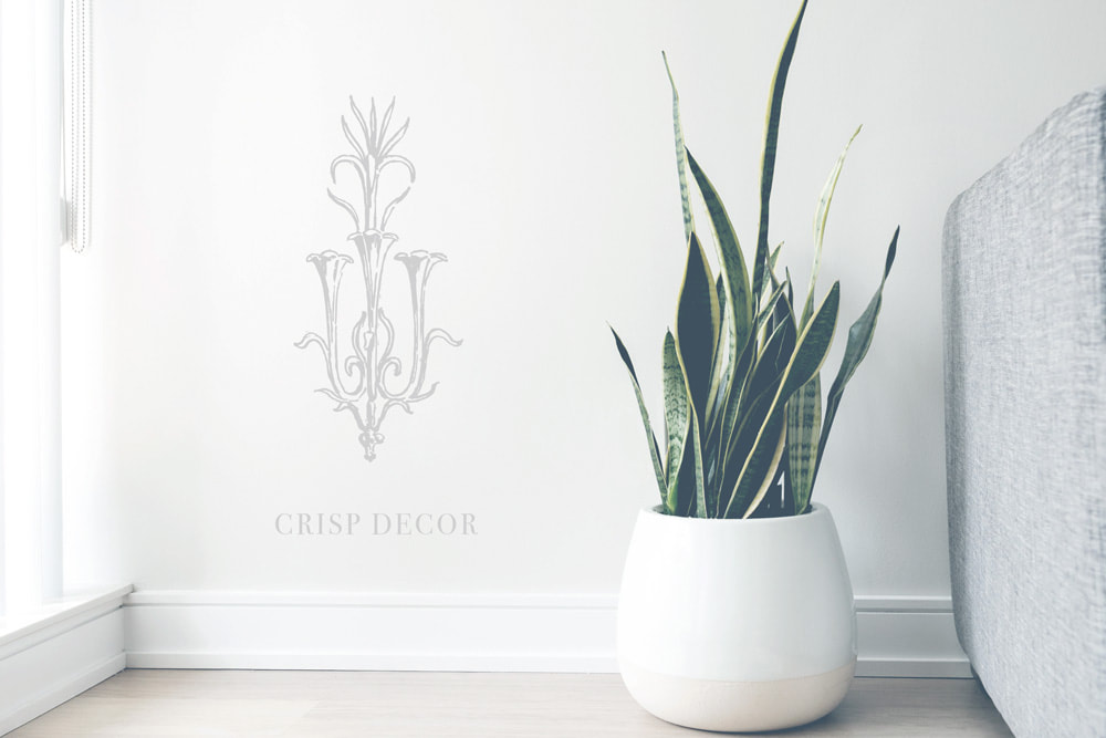
12. Crisp DecorTumblr blog about Interior decor.
Asks
Brand
Solution Minimal was my initial focus for this design. Follow modern minimal logo trends, I tried using simple geometric shapes, small slashes, and monogram styles but non of it had that decor vibe. So, I moved on to a vintage illustration of a chandelier and paired it with Didot, the Audrey Hepburn of typefaces. Now it's unique and speaks to decor with a timelessness. 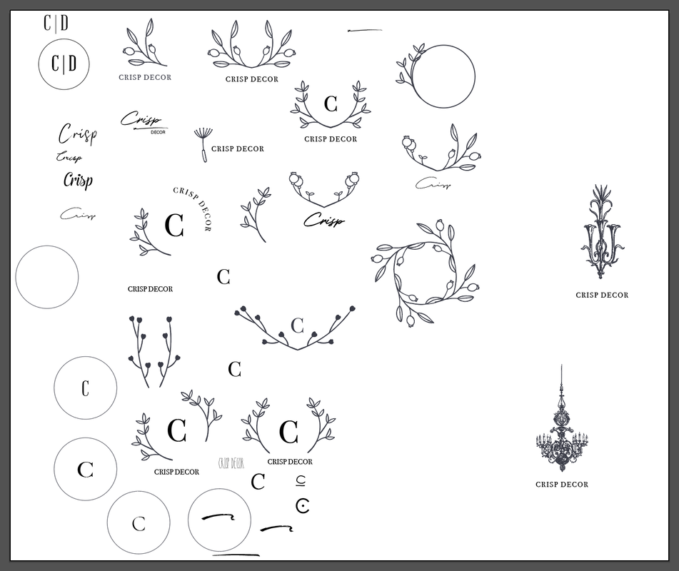
|
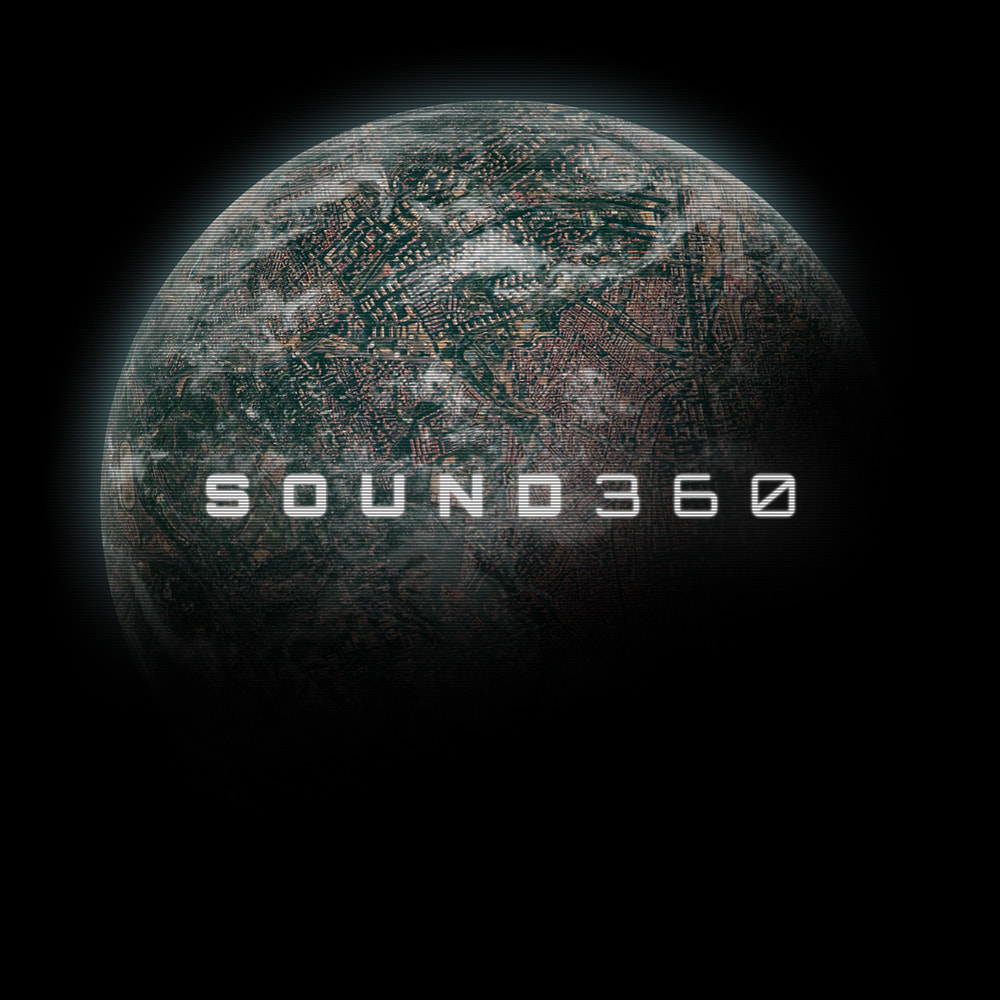
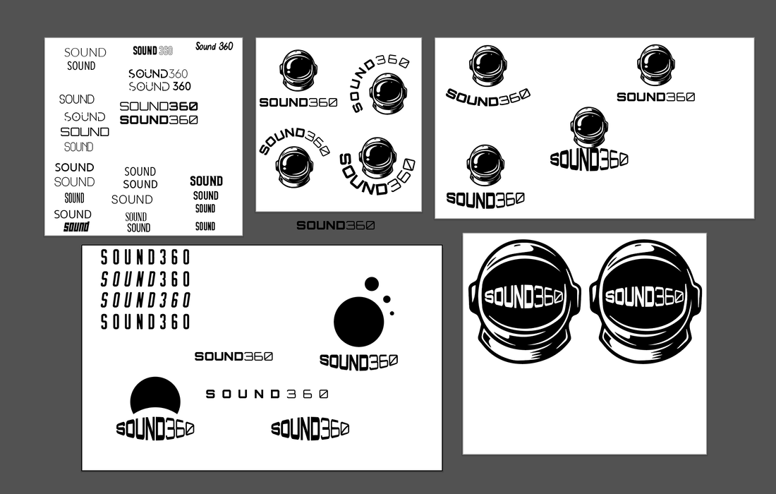
13. Sound 360Hardware startup that develops speakers that can map 360-degree videos onto stereo speakers for interactive events.
Asks
Brand
Solution For this logo I focused on the sci-fi and modern type. I worked through ideas with a mark but found the type alone worked best. It can be paired with any imagery or treatment to show roundness and space like the ask requested. To demonstrate this, I paired the type with a planet and added some distortion to mimic what is commonly seen with space and sci-fi themes. |
|
|
14. Radnika FoundryType foundry.
Asks
Brand
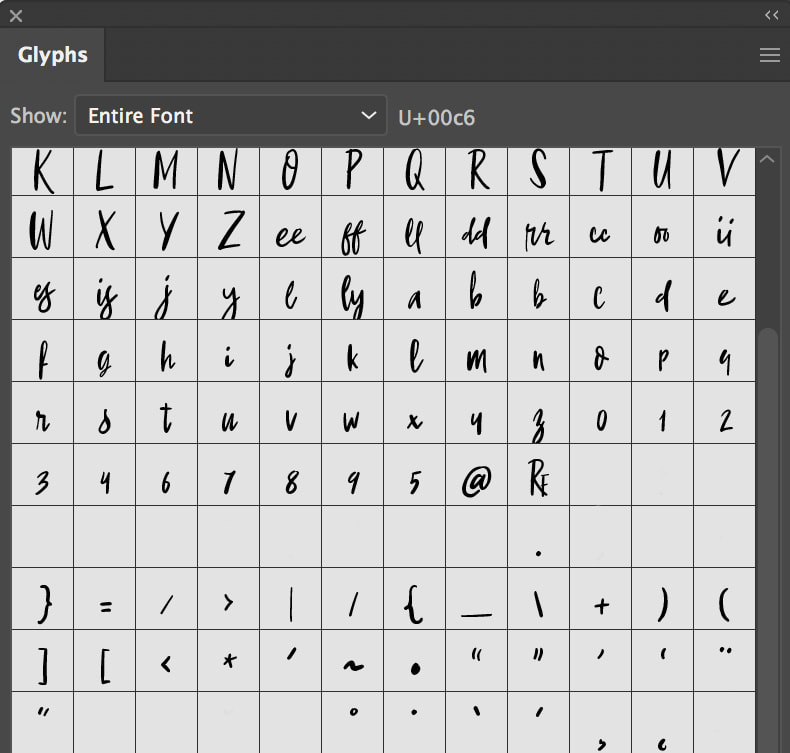
Solution This logo was a quickie for me. I knew I wanted to show off the typography of the foundry and create a mark from that. Since this is an exercise and the foundry itself does not actually exist, I found a typeface that looked like what they would create. After adding that typeface to the full name, I pulled the initials and created a mark from them. It was my first idea and I did no sketching. The opposite of what everyone tells you yet I really enjoy this logo and am happy wth the results. I tested it the glyph window and it reads small scale like the ask. |
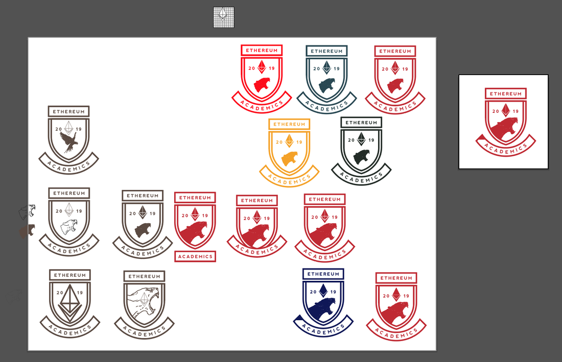
15. Ethereum AcademicsOnline school that teaches computer science students how to code on the Ethereum network.
Asks
Brand
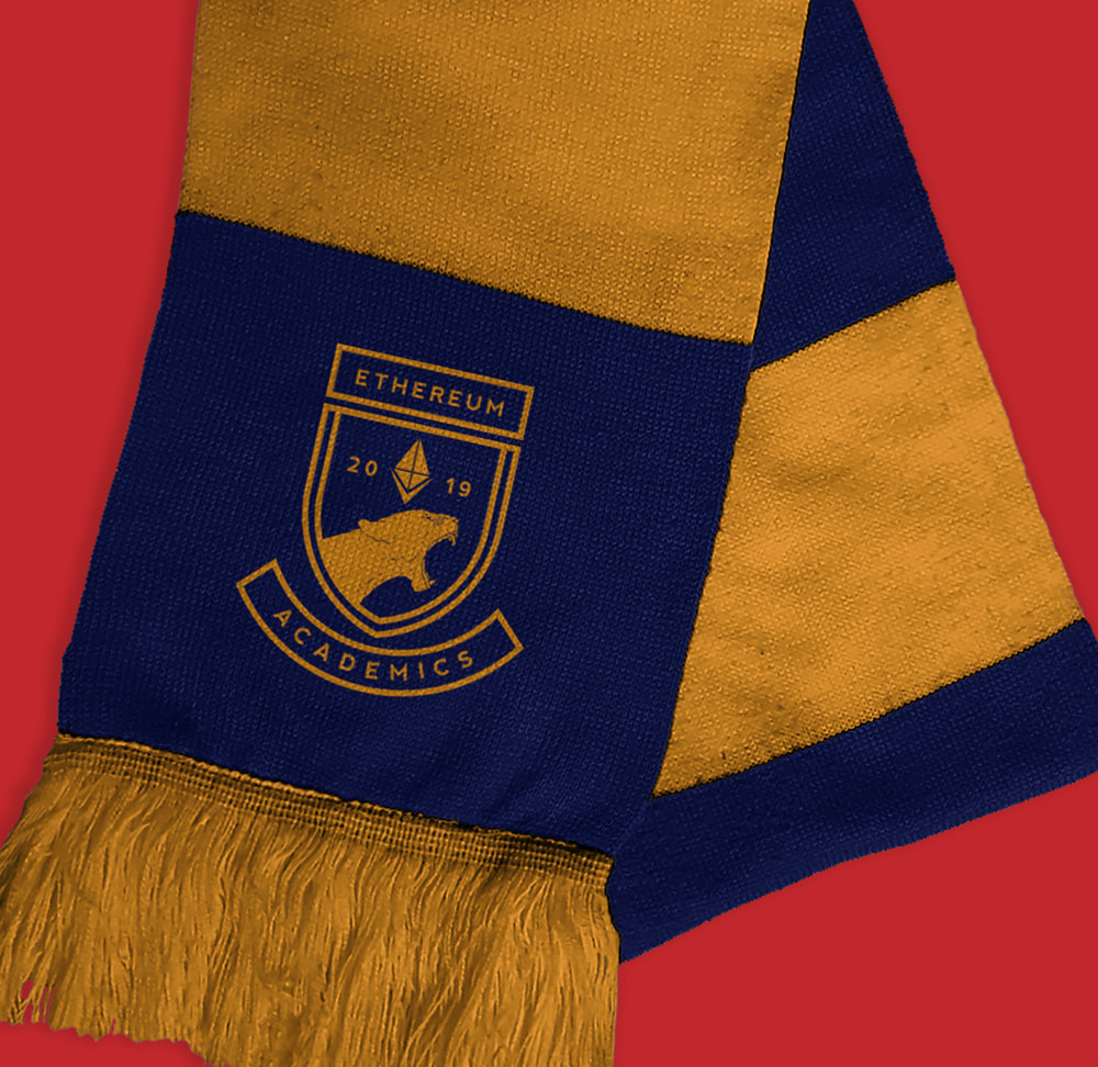
Solution Due to this academy being challenging with intense courses that wants to steer clear of typical and playful design, I began my research with the logos of the most academically difficult universities in the US. I noticed they often use a badge as an icon with deep blues and reds for color. So, I created a badge identity with the Ethereum logo incorporated in the imagery. The roaring mountain lion adds to the feel of tough and intimidating while the badge displays an air of refined and elite. If I had more time, I would have worked to make the mountain lion illustration fit the badge style more so it would be a more cohesive logo. 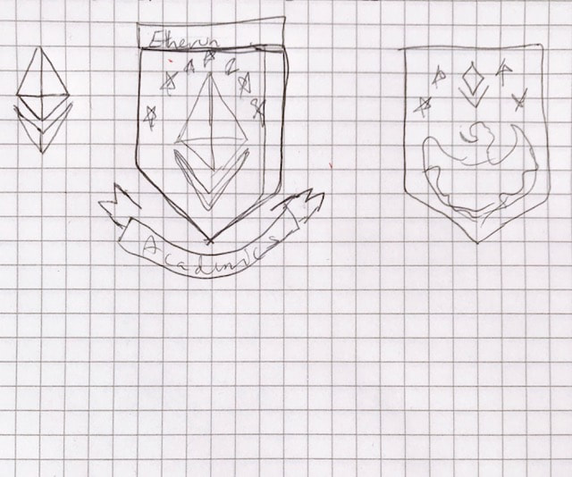
|
|
|
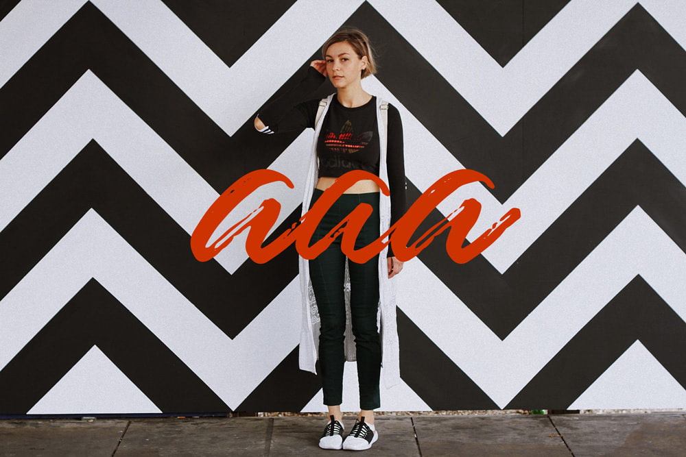
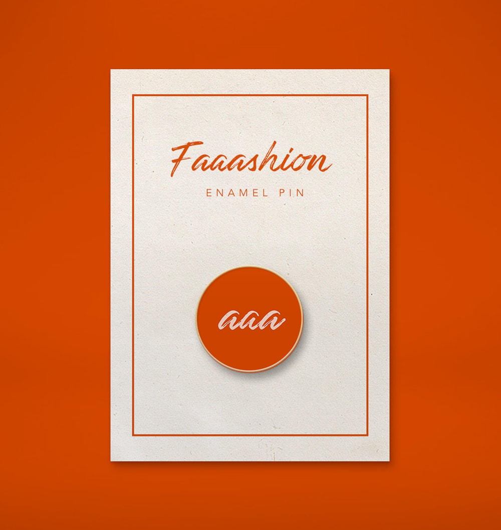
16. FaaashionUrban style fashion blog for men and women.
Asks
Brand
Solution Fashion blogs tend to have text only logos. The trend is generally black and white, no other color because the large images of clothing that make up their content speak for themselves and are ever changing in color. With that in mind, I decided to focus on a type icon for this blog. I found a script font that had the right amount of personality and legibility. From there I focused on the three 'a's as they are the most memorable part of the blog name. AAA already exists but, I think this mark works as the type and feel is so different from AAA. I chose bright red because it such a stand out color, hard to ignore. And, the pink because of how soft it looks against the red. If I were to grow this brand, I would change the color palette with the season. And, I wouldn't shy away from incorporating pattern as well. 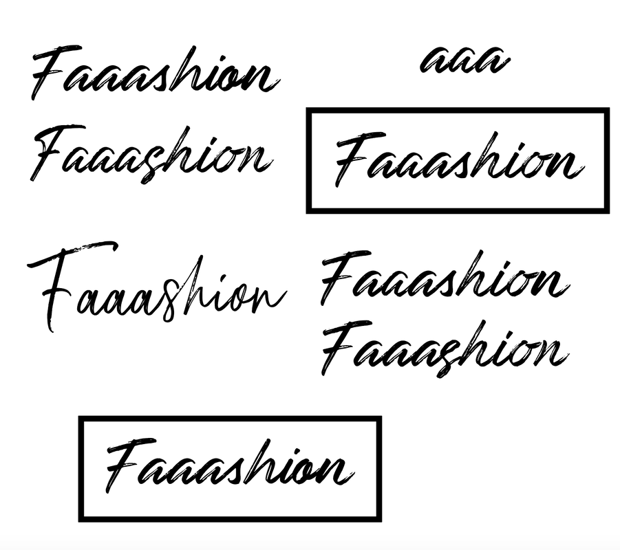
|
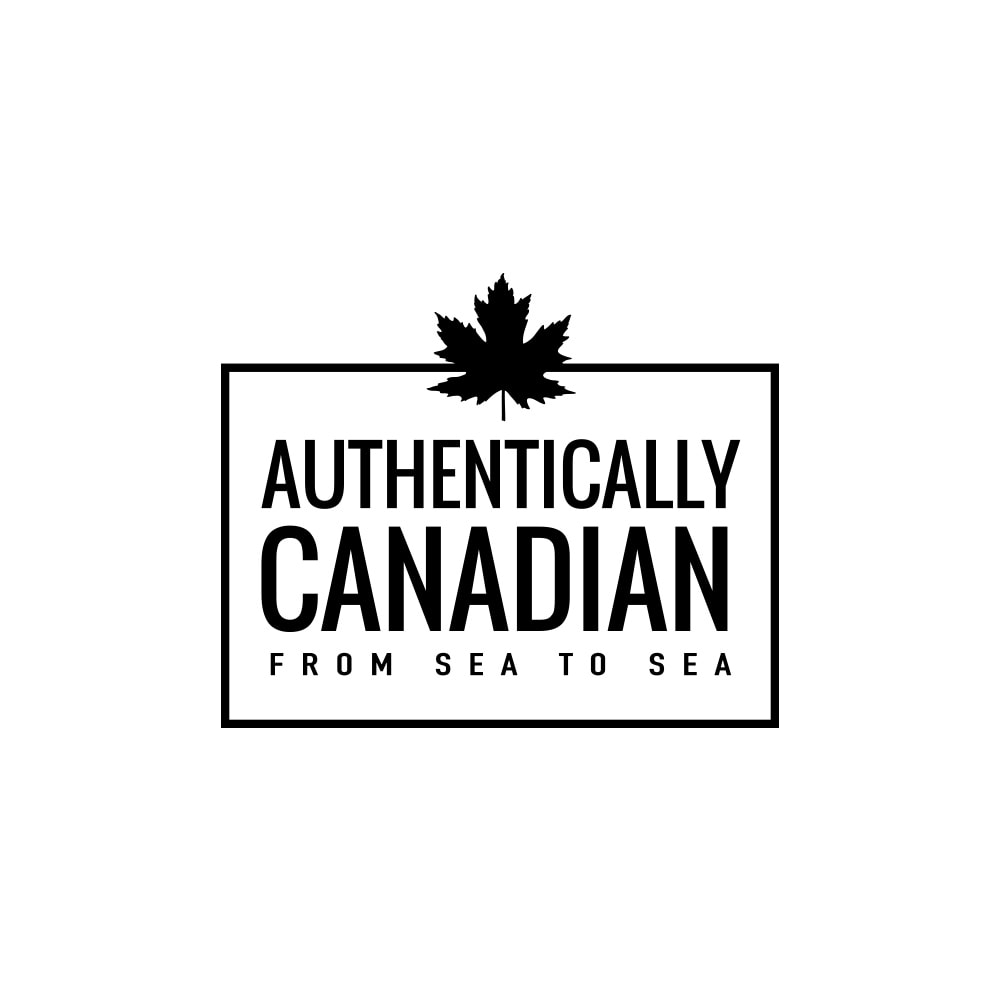
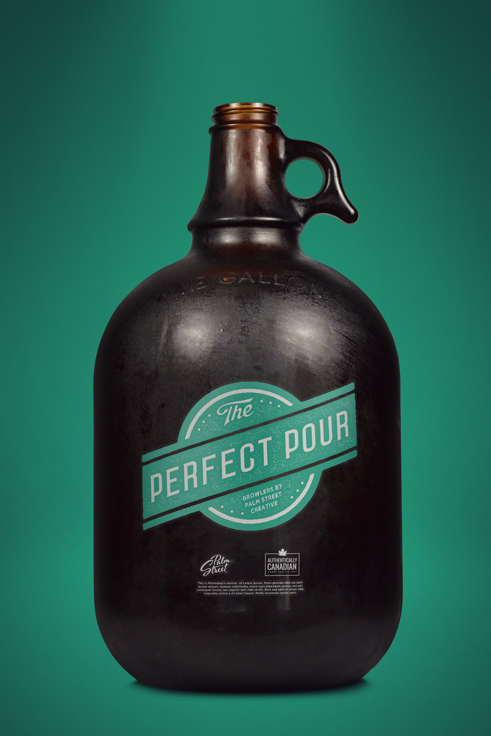
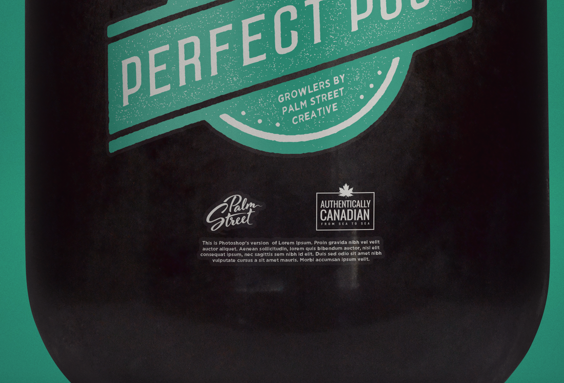
17. Authentically CanadianCertification program that provides an identifiable label for companies to use on their products to proudly verify that their products were fully made in Canada.
Asks
Brand
Solution My initial instinct was to make this a 'stamp' and for it to be round. What I found was that there was just too much text for a round shape. It isn't that I couldn't figure out how to incorporate the amount of text, but to do it and still have it be legible when a small sticker on a product. I could fit the name but not the tagline. So, I moved on to a rectangular shape. To keep a stamp feel I used a stroke around the text to contain it. Once I had the main text and icon dialed in, I added the tagline. I wanted it to be less noticeable so I made it significantly shorter and tracked out the text to be the same width as the main text. Although small, it is still legible given the generous tracking. 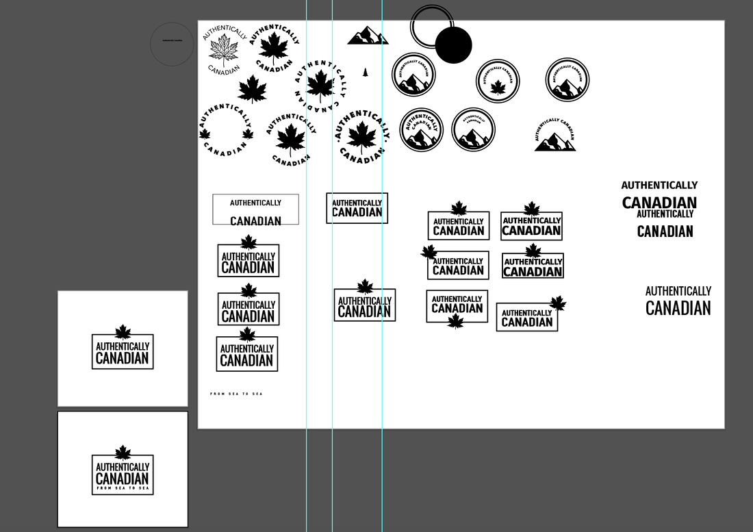
|
|
|
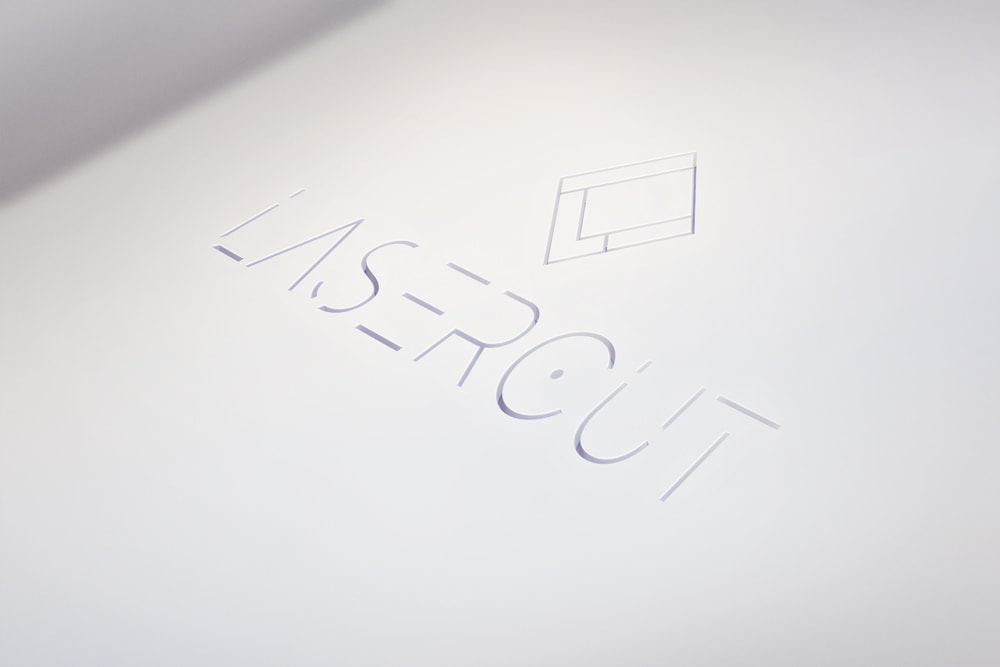
18. LaserCutAbrasive machining using the latest in computer controlled CAD/CAM and multi-headed machines.
Asks
Brand
Solution I spent a great deal of time working through 3D type concepts but all felt very expected and overdone. I opted finally to use a display typeface that has cuts in it. It is also thin to mimic a precise cut like you would expect in a professional machined piece. From there I worked on an icon with similar elements that incorporates the 'L' from Laser and 'C' from Cut. 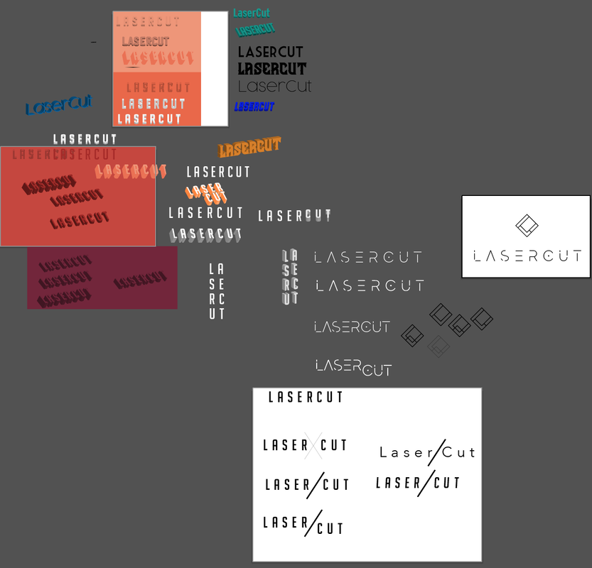
|
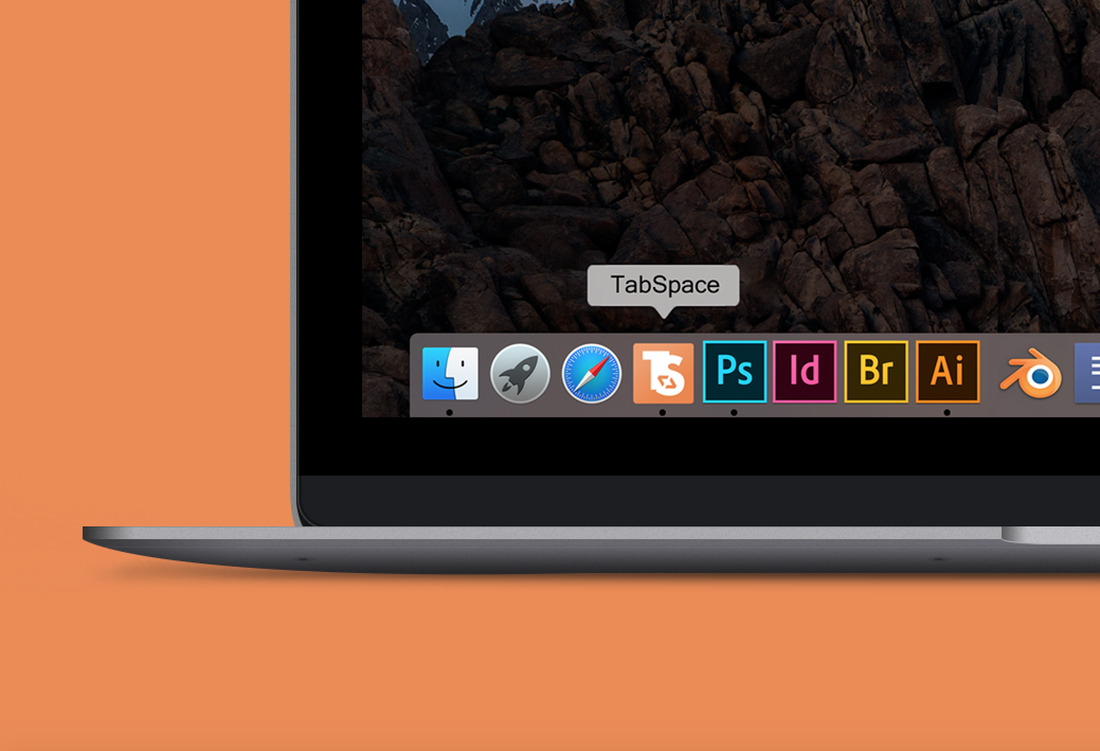
19. TabSpaceMac OS X program that simplifies the process of debugging code for software engineers.
Asks
Brand
Solution Initially for this design I wanted to create the 'Mailchimp' of code bug killers. A friendly looking animal, unique and memorable. I started with an anteater, then centipede, then a traditional bug look. But none felt right. The reason the chimp for Mailchimp is so successful, to me, is that it's very purposeful. Chimp is in the name. So, I scrapped that route and began exploring type as a solution. I worked to merge the initials together and ultimately decided to add an icon to it that mimicked what a tab button does. By tilting the tab arrows, it allowed me to fit the shape within the curve of the 'S' as well as adding some movement to the design. To build on that, I added a subtle gradient to the background so that the design had some more movement and displays as less stiff and static. 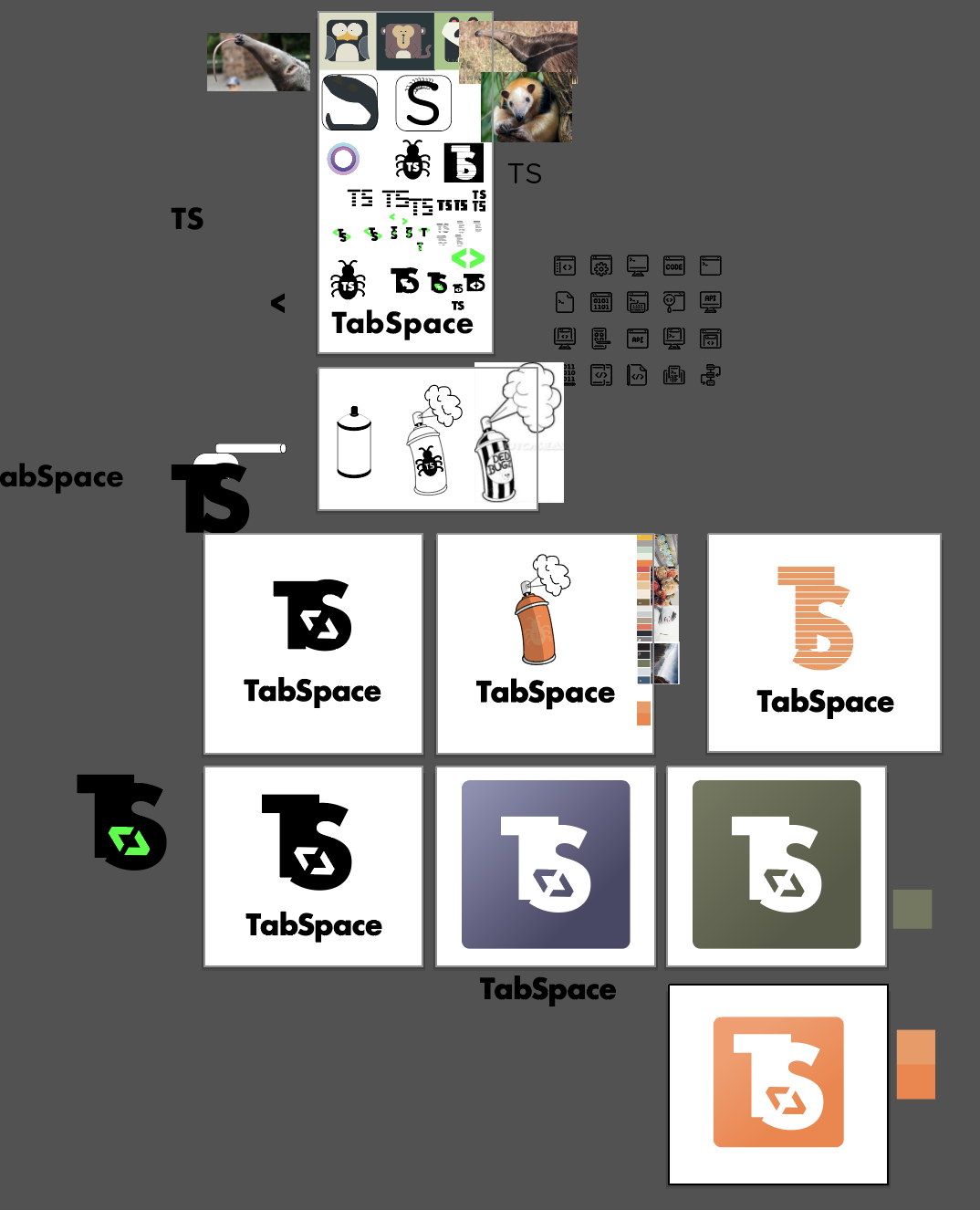
|
|
|
20. QuantumSmall company in Germany that develops open-source frameworks for PHP developers to use when creating online applications.
Asks
Brand
Solution Speed, stability, and minimalism. These key words were my focus throughout the entire design process of this logo. I knew I wanted to use the 'Q' as the main logo icon for this project as to steer clear of any icon that might be childish. I began by looking for the right 'Q', one that was serious yet unique. I tend to associate italics with speed as well as the elongation of any shape. So, when I found this italicized stretched 'Q', it struck a cord. Just the 'Q' on it's own seemed too stale. I wanted to bring a bit more purpose to it. I decided on dots that represent chunks of code. Stacked them side by side and filled the 'Q' shape. You could argue that it is now less minimal, but if you look at the surface area covered, it's far less minimal than a solid 'Q'. 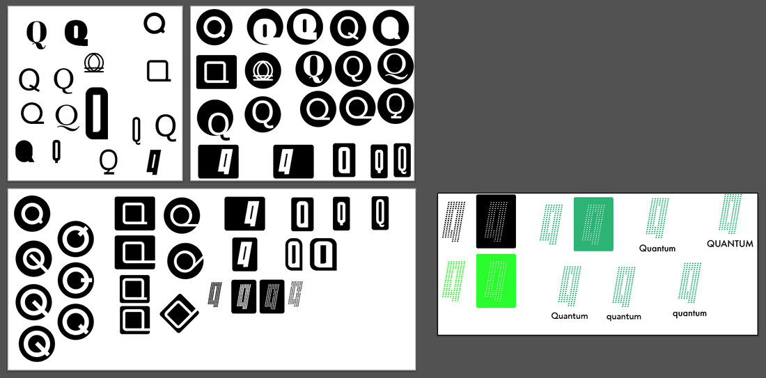
|
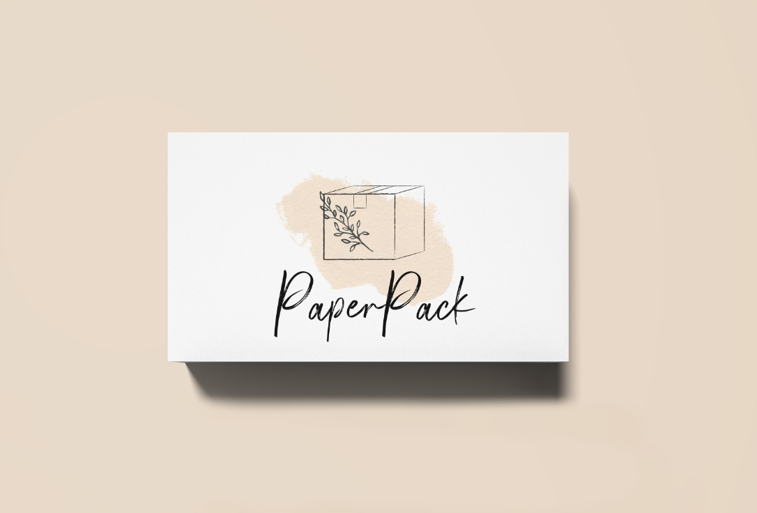
21. PaperPackSells custom-made packaging, trays, and inserts for customers worldwide.
Asks
Brand
Solution Due to the clients need to stand out against their competition, I first sought out what their competition looked like. I noticed strong colors and a very 90's corporate look. Since PaperPack uses natural materials, I decided to showcase that and make them stand out by using soft tones and marks. 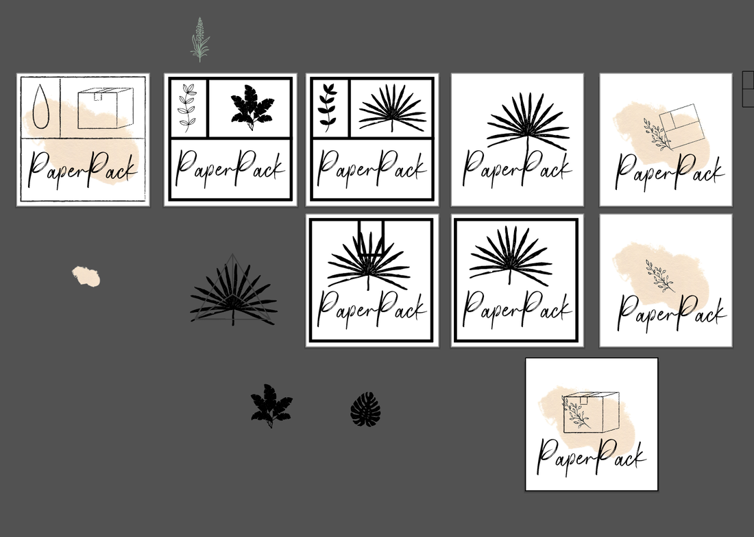
|
Logos of competition on Alibaba
|

|
22. JP LetteringSmall studio in Vancouver that specializes in murals and hand-lettering typography.
Asks
Brand
Solution Since this collective of artists creates typographic murals, I thought they needed a logo that had typographic creativity without being 'too much'. I created a color version as well as a black and white version that is more simple to be used on colorful murals without competing with them. 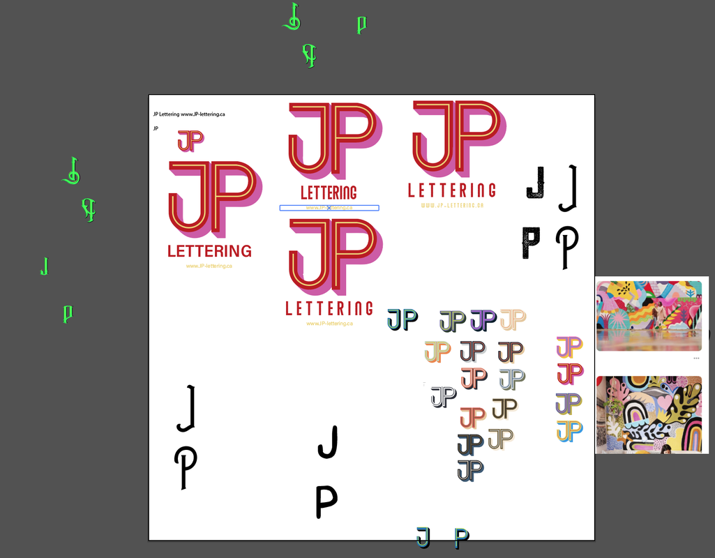
|
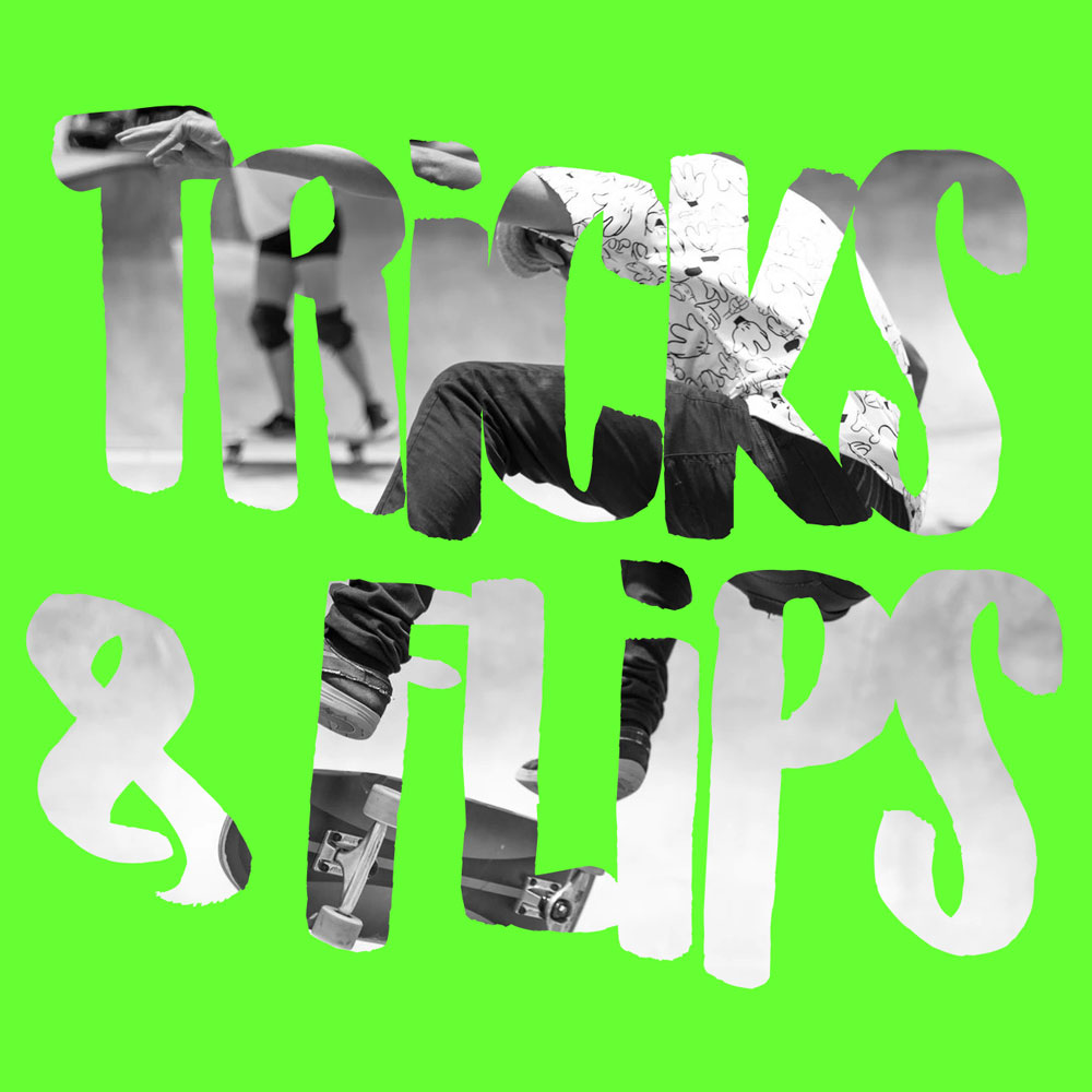
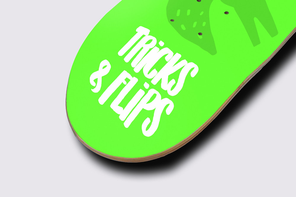
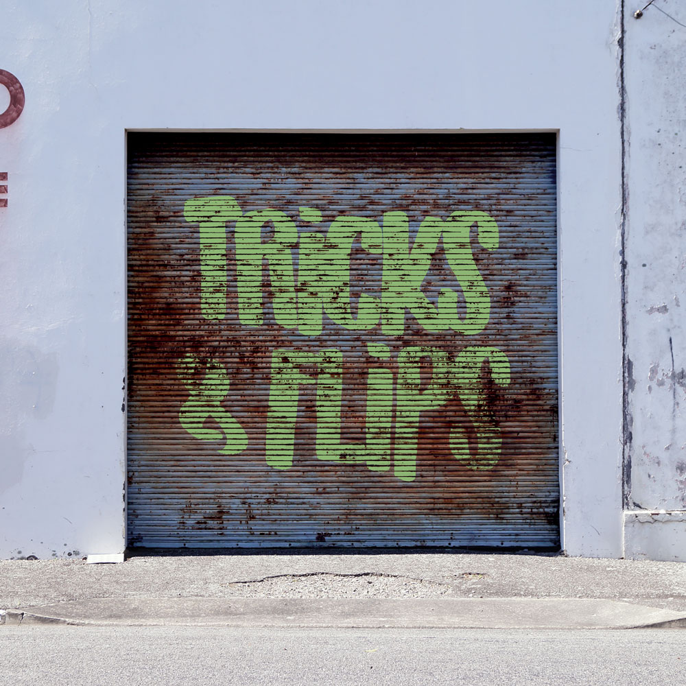
23. TRICKS & FLIPSSkateboarding merchandise shop.
Asks
Brand
Solution Skateboarding is always thought of as rebellious, edgy, and 'street'. I worked on a globe and skateboard logo but everything looked cheesy and childish. So, I moved on to the word mark and brought the street feel into the logo with a hand drawn graffiti feel. 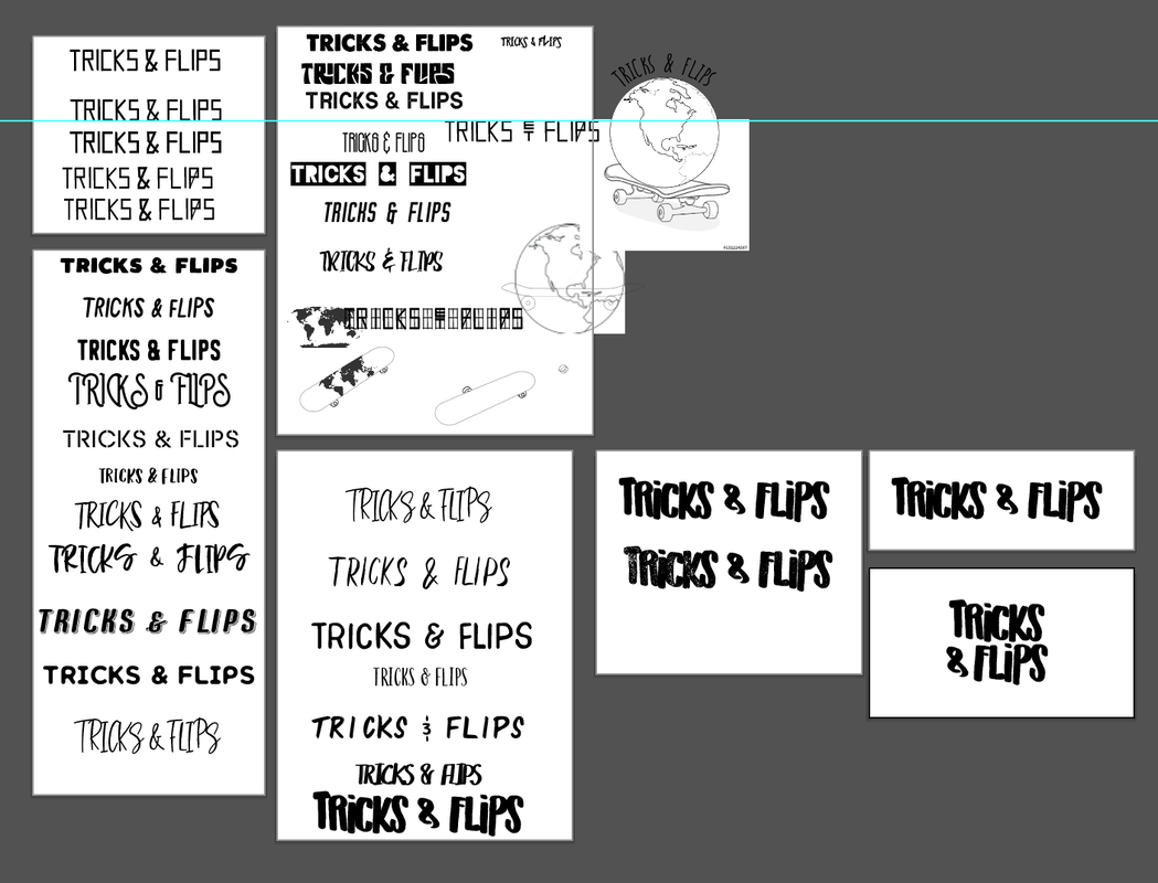
|
|
|
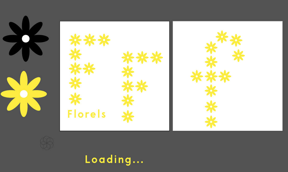
24. FlorelsSmall game development studio.
Asks
Brand
Solution When working through sketching ideas I was drawn to the idea of incorporating elements of foliage into the 'F'. But, when I sat down to illustrate, I made the 'F' in daisies and stuck with it. It was hard not to go down a pixelated route as this is for 'bite-sized' video games but they clearly did not want anything retro.
|

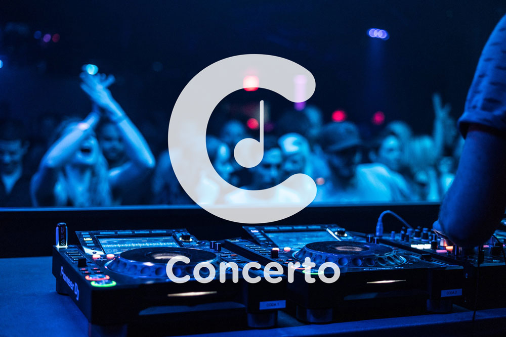
25. ConcertoProvides SMS updates when local artists are about to announce a tour in your city.
Asks
Brand
Solution I stayed far from Spotify's logo by not using any sound wave looking details. By using a rounded font and friendly colors the logo appears trustworthy. The final touch was to add an element of music, a single note. It isn't groundbreaking but it's memorable and covers all the needs of the client. 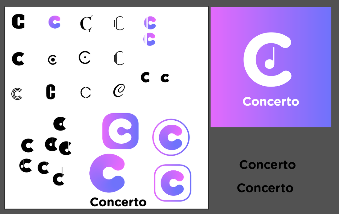
|
|
|
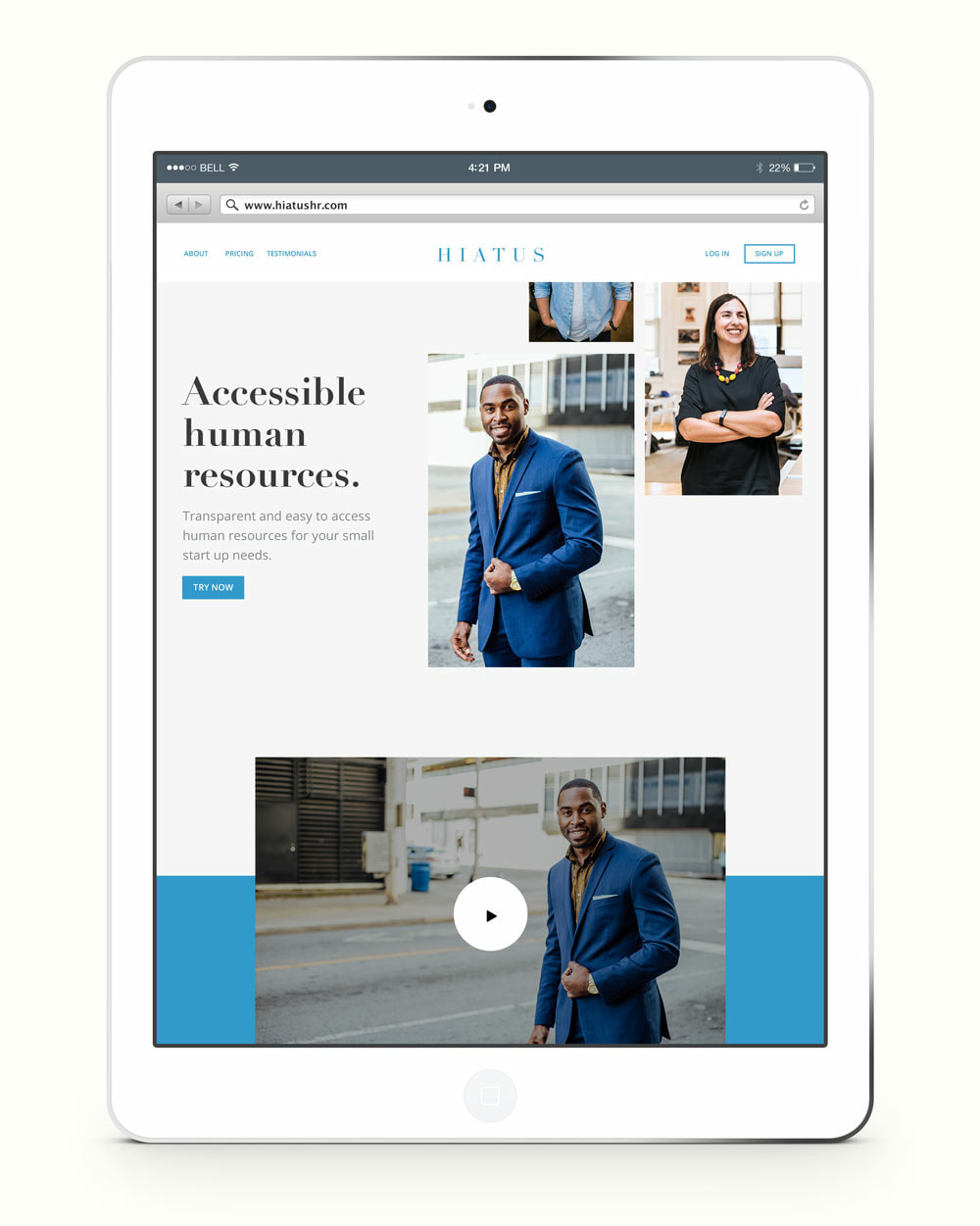
26. Hiatus HRMaking human resource services accessible to smaller startups.
Asks
Brand
Solution Since this is software for executives I chose a high end looking font with lots of tracking. The open tracking also represents transparency with it's wide open negative space. Blue is a color of calm and approachableness giving a consumer friendly feel. |
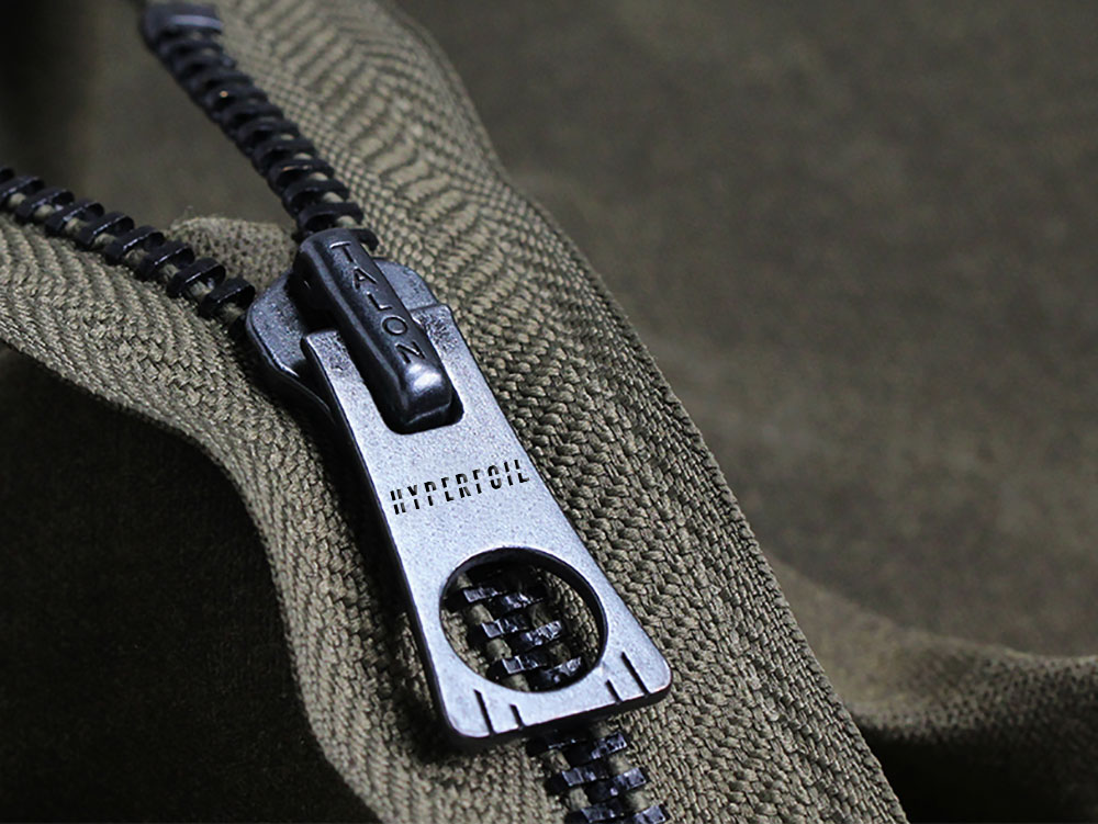
27. Hyperfoil ClothingFashion designer running an independent clothing company.
Asks
Brand
Solution Futuristic type always seems to appear chopped and italicized. So, I did both to this logo. This logo was a quick one. I had the idea in mind and skipped sketching. My initial idea was to have a slash through the entire name but cutting out that slashed shape looked so much more futuristic and interesting vs. punk/edgy. 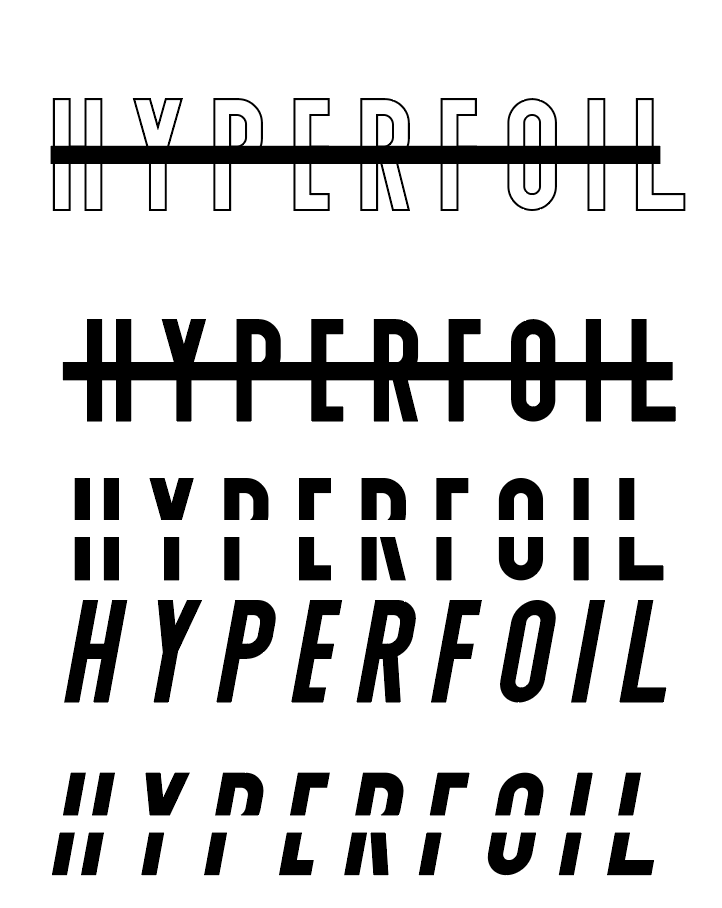
|
|
|
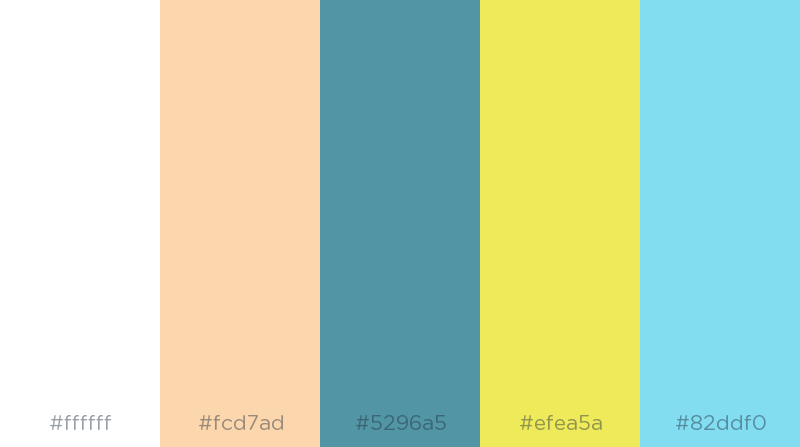
28. TXTApp that makes the task of note taking and communication within large teams easier.
Asks
Brand
Solution This was a fun one. I worked quickly to find the right text logo so I could dive into the color palette. I chose a simple sans serif font and kerned the 'T's close to the 'X' to make the word mark many parts that make one, a metaphor for the product itself. On to the color. Initially, I was thinking black text on yellow, like pen ink on a legal pad. But, when I started working on the color palette, I loved the combination of blue against yellow. I added a darker blue for contrast, a salmon-y pink, and a white. It's fresh and unexpected while staying friendly. 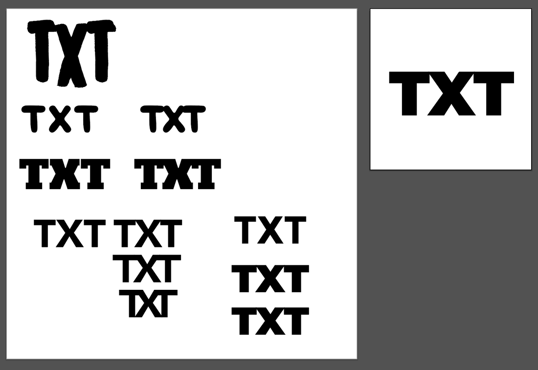
|
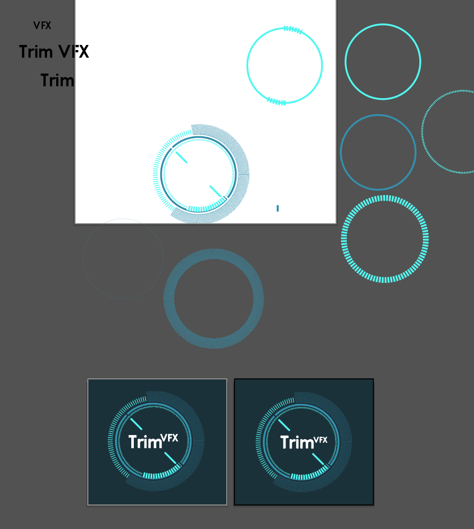
29. Trim VFXVisual effects studio focused primarily on fictional user interfaces.
Asks
Brand
Solution I decided to make a simple wordmark logo and to build FUI off of it. That way the wordmark can be used as the logo as needed as well as the full logo with FUI elements. I chose a simple and clear sans serif font and popped it with white. The rest of the logo is made of decorative UI elements to add energy and dynamism. |
|
|
30. Post to BehanceI decided instead to post all logos to my portfolio. I'm actually a bit bummed that there wasn't a 30th logo.
|