Burroughs Family Farms
|
My Role Strategy, design, website build
Goal Optimize the Burroughs Family Farms homepage to drive sales and ease of access to popular products. |
Website burroughsfamilyfarms.com
|
ADA Compliance
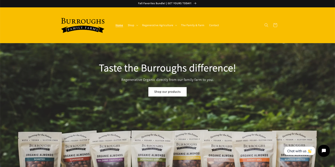
Before we could dive in on optimizing the BFF homepage I had to address one glaring concern, ADA compliance. If you sell anything directly from your website, you HAVE to comply with the parameters set by the Americans with Disabilities Act (ADA). Fines for violating the ADA can be around $15,000 PER infraction. I noticed right off the bat that their nav menu had white type with a yellow background. This combination creates extremely low contrast making it very hard to read. This is a clear violation of the ADA. Just to be sure, I used a free scanner to check their website and sure enough, it was not compliant.
The yellow they were using in the background of their header, although great, was not on brand. Their packaging is black type on a creamy taupe background. Bright colors are used on their packaging, but only to discern one flavor from the next. I decided to continue this on their website to create better brand consistency and recognition.
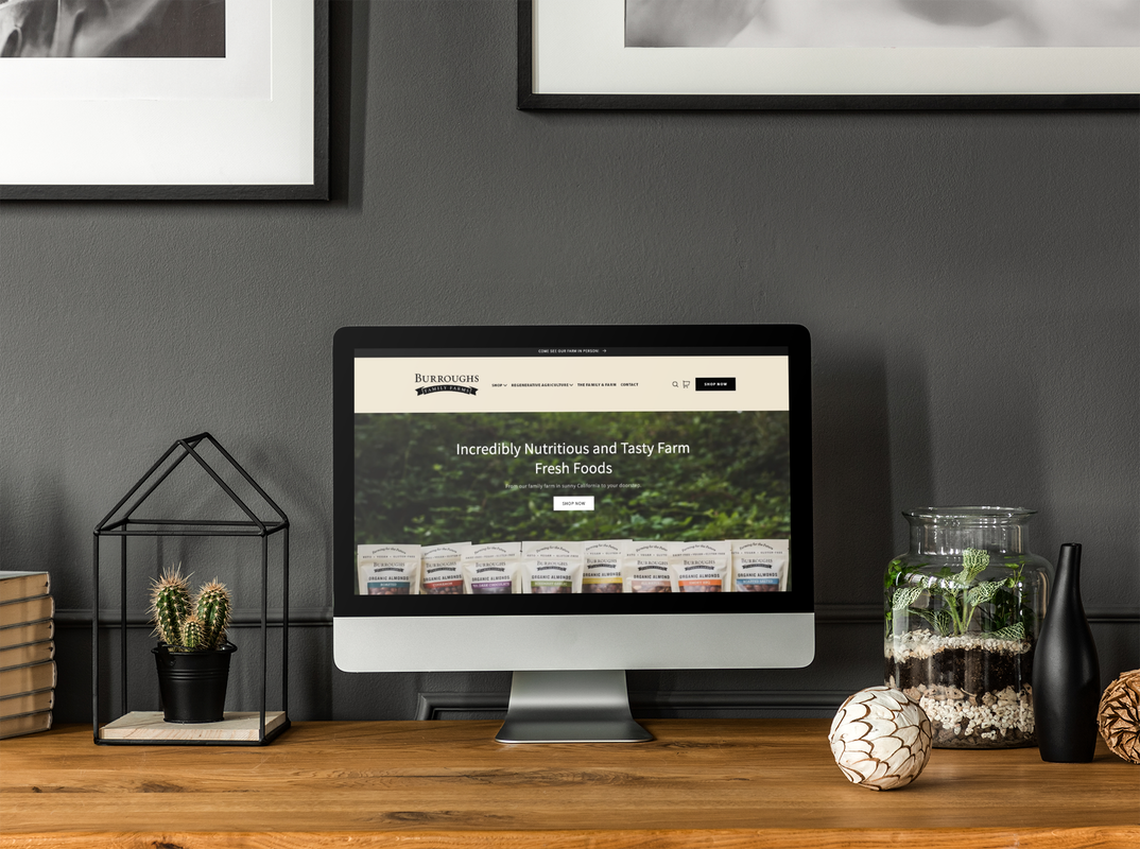
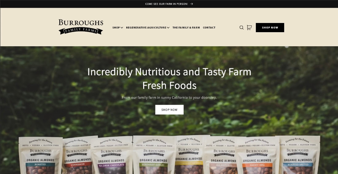
With the header now set to black type on their brand-consistent cream background, the contrast improved enough to be compliant with the ADA standards keeping them safe from any lawsuits. On top of that, we added a Call to Action button to "Shop Now". Always making it easy for customers to shop.
And, I didn't ditch the yellow altogether. I used it on their website like they use bright colors on their packaging, sparsely and with purpose.
Website Refresh
First order of business, we updated the header and sub head text to quickly explain WHAT the Burroughs Family Farms really is. You have seconds to get this message across to potential shoppers. So, it needs to be clear and direct.
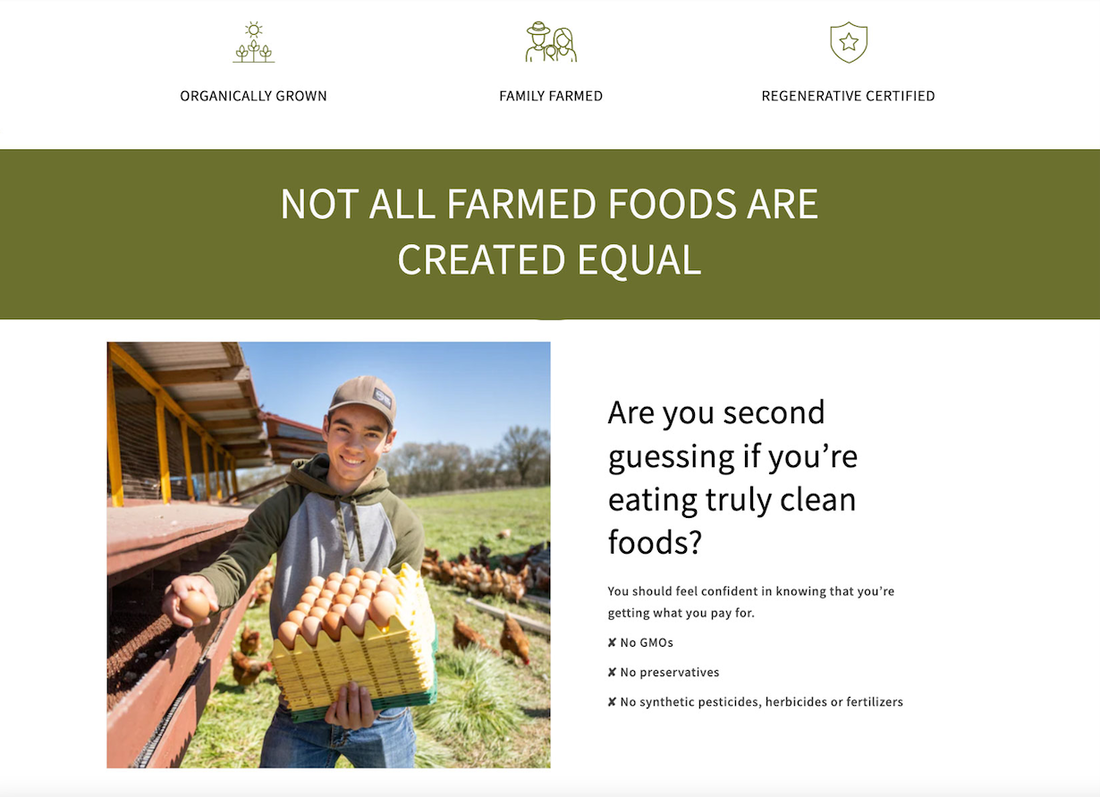
Just under the fold we ditched the long text header and displayed their key attributes in 3 quick descriptors accompanied by icons. Shoppers are scanners so breaking up long text into easy-to-scan bits not only gets your point across quicker and easier but also makes for a better shopping experience for the customer.
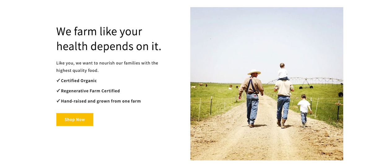
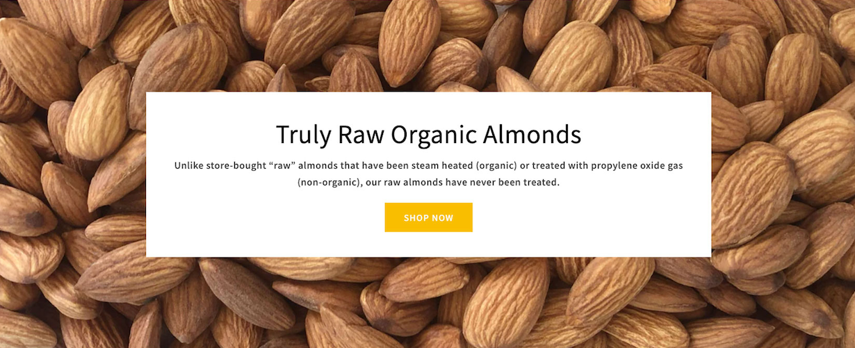
After, we used this space to quickly touch on pain points, educate shoppers about food cleanliness, quality, and how point out how BFF is different than other farms.
After, we used this space to quickly touch on pain points, educate shoppers about food cleanliness, quality, and how point out how BFF is different than other farms.
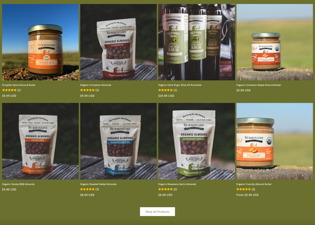
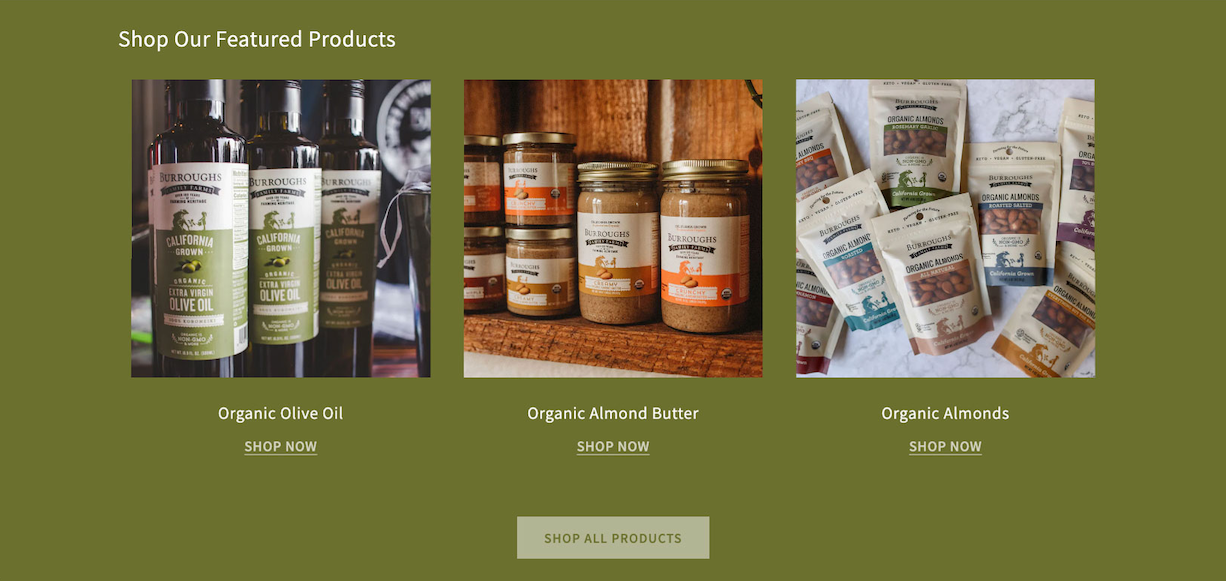
Next we guided shoppers to the top 3 products our client would like to sell. As well as created an easy and quick way for shoppers to locate the truly raw almonds, a popular and unique item BFF offers.
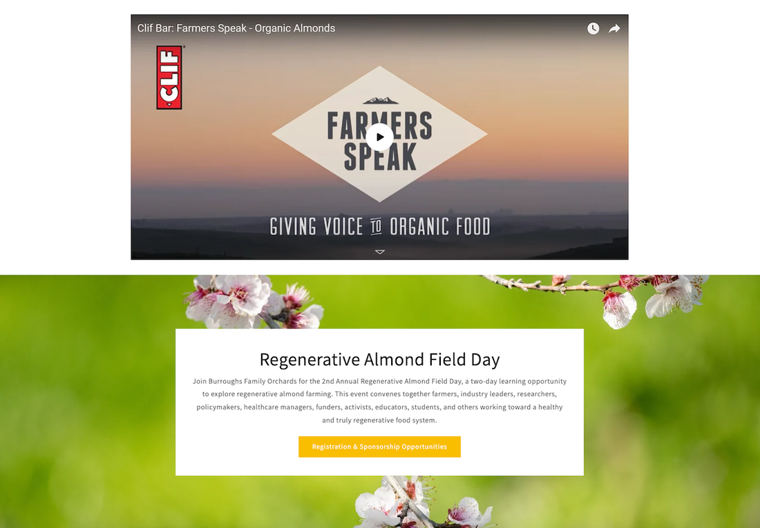
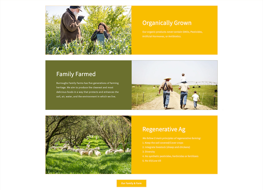
Below that, we relocated the Regenerative Almond Field day to a small 3 column section because they wanted to reduce focus on it. We paired it with BFF's regenerative certification and an award they received to build trust.
Below that, we relocated the Regenerative Almond Field day to a small 3 column section because they wanted to reduce focus on it. We paired it with BFF's regenerative certification and an award they received to build trust.
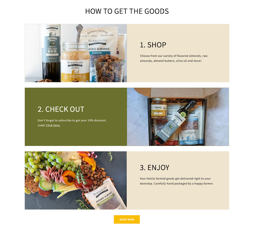
As common as online shopping is and has been for years now, it's still good practice to break down how to purchase from the site.
So, we refreshed this section to show shoppers how easy it is to shop with BFF in 3 easy steps.
So, we refreshed this section to show shoppers how easy it is to shop with BFF in 3 easy steps.
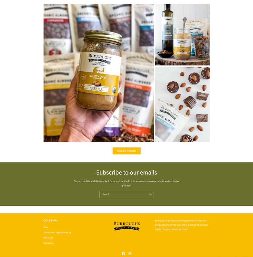
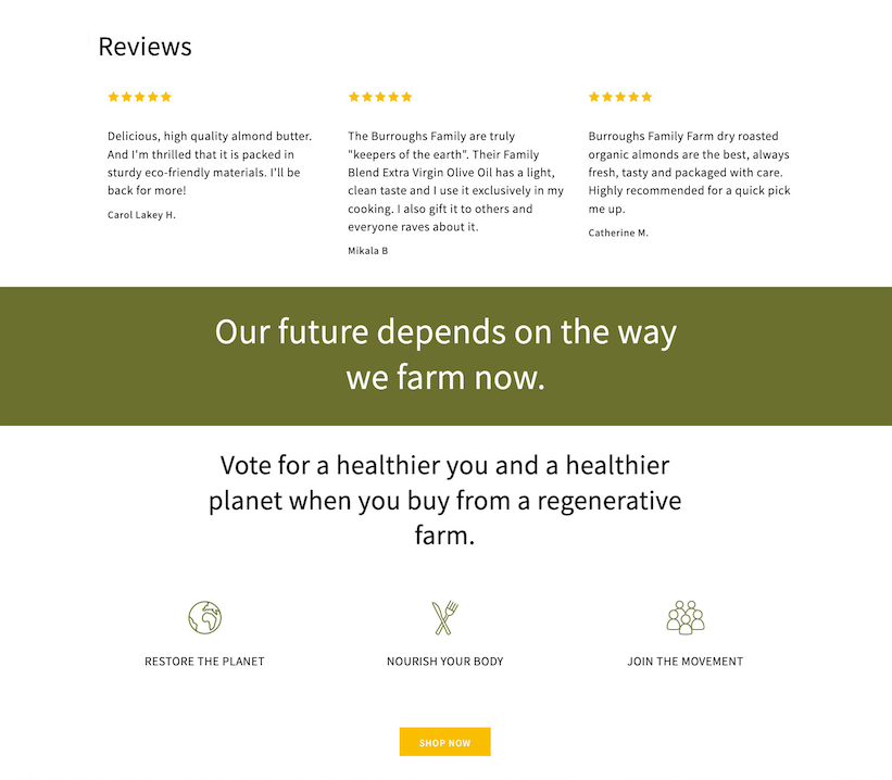
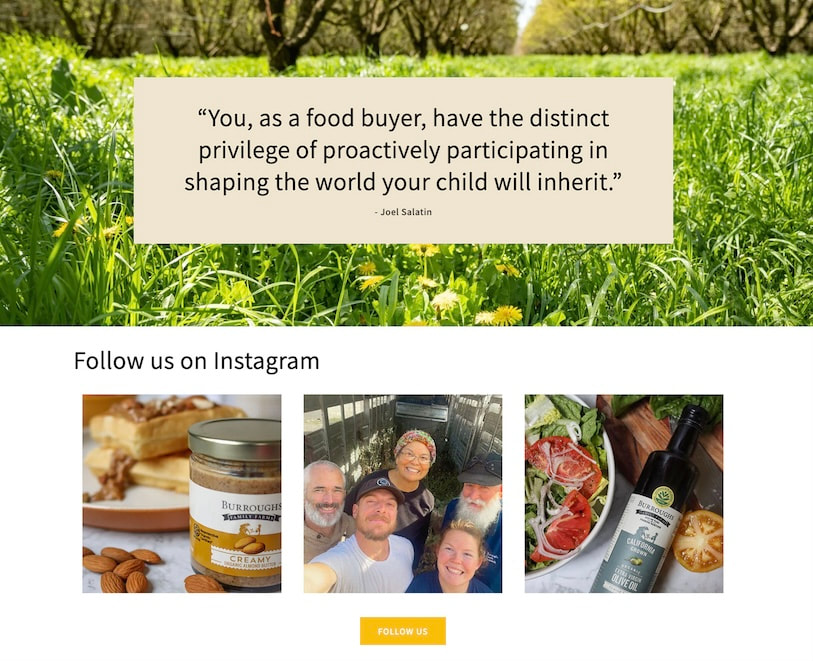
Finally, instead of sending shoppers off to social just yet, we organized this section to build more trust and to remind the shoppers WHY they are choosing BFF. Then, we added the Instagram call to action as well as one for their newsletter before landing at the footer which has now been updated to match the nav.
