Listening to Smile
Rebrand, Website, Album Covers, & Membership Portal
|
My Role Graphic Design & Art Direction
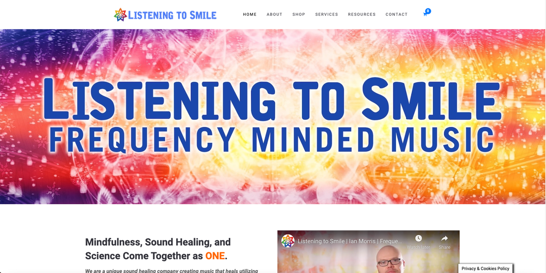
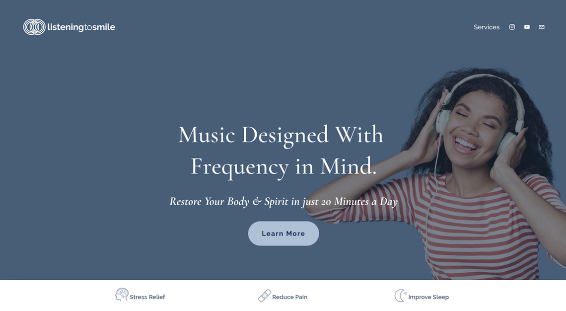
Website listeningtosmile.com What Listening to Smile creates music using frequencies that target healing.Client needed a more modern, clean, and professional logo that was affordable to print. As well as an updated website and membership portal that was branded and streamlined. |
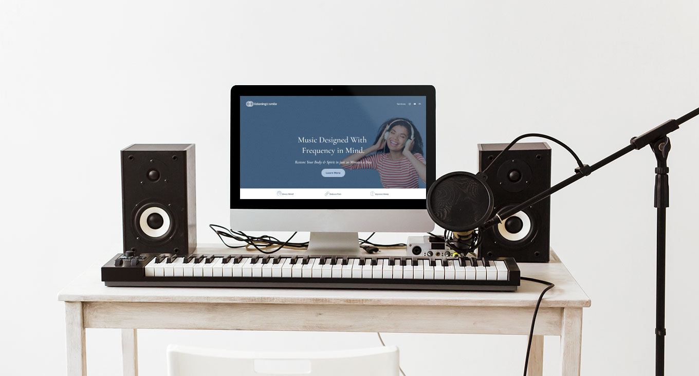
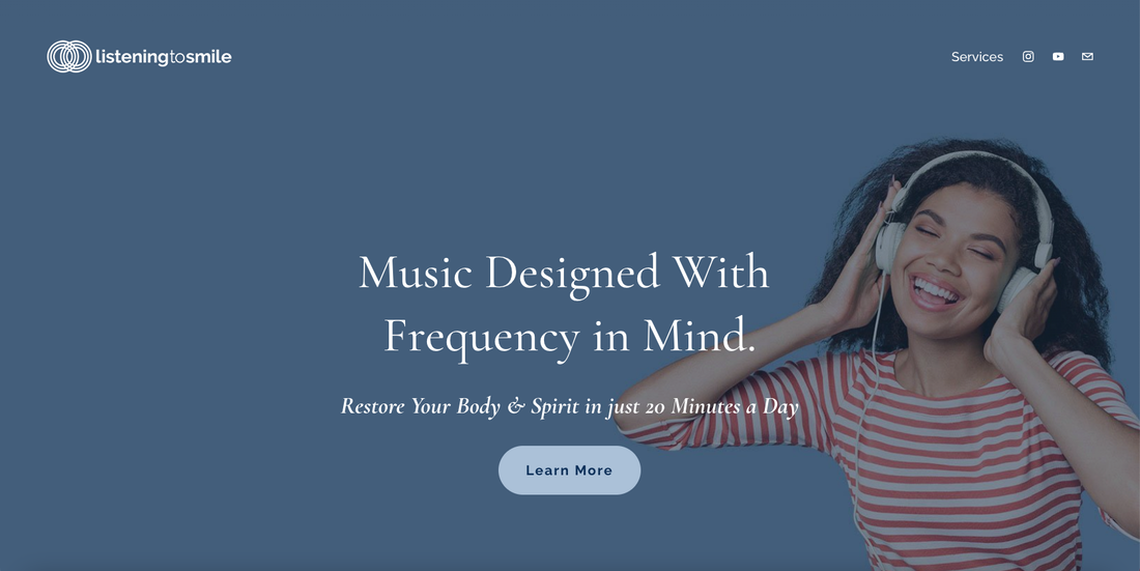
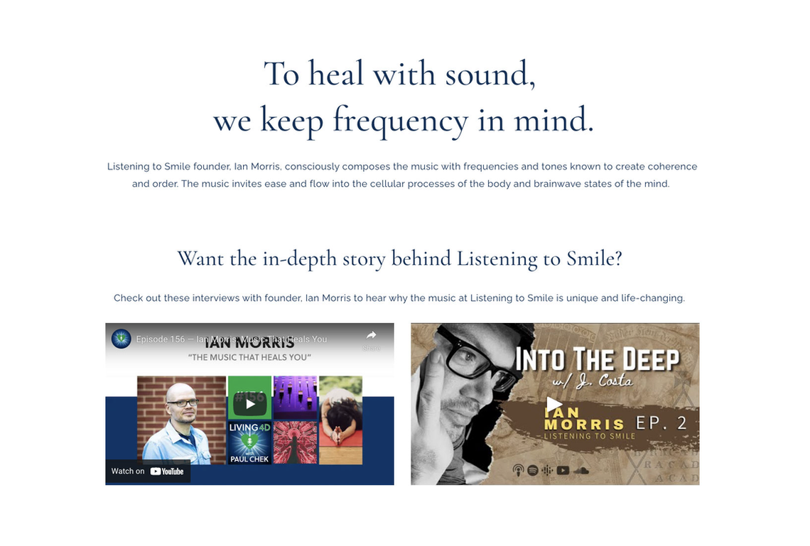
Solution Client has deuteranomaly color blindness, so I created a brand color palette that is within his color range but also modern and professional. I created a logo that is one-color making print work simple and affordable. The icon consists of two vibrational rings crossing to create a yoni, the birthplace of all sound. Using a sans serif typeface that is clean but approachable brought his logo up to date. I applied the new branding to his website combined with clean imagery and updated copy. And, updated the album covers to have a consistent design pattern helping to preserve the brand. And, finally, I built out a portal for his membership program so members can experience a more rich and consistent membership experience.
|
Brand Color Palette
Logo Redesign
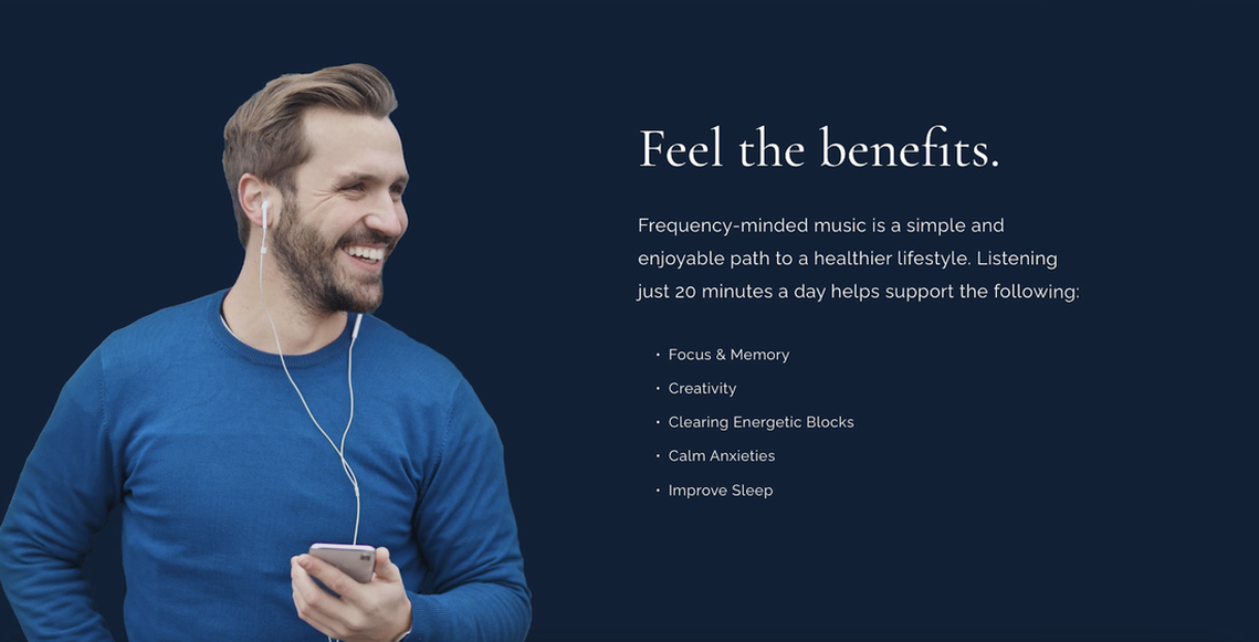
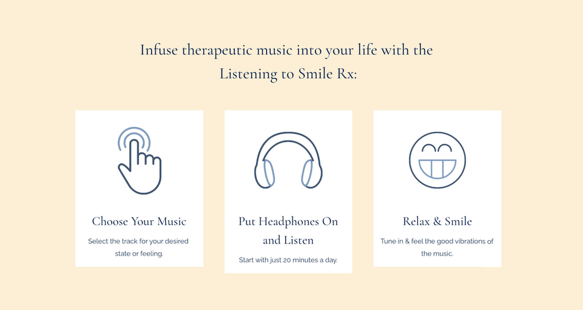
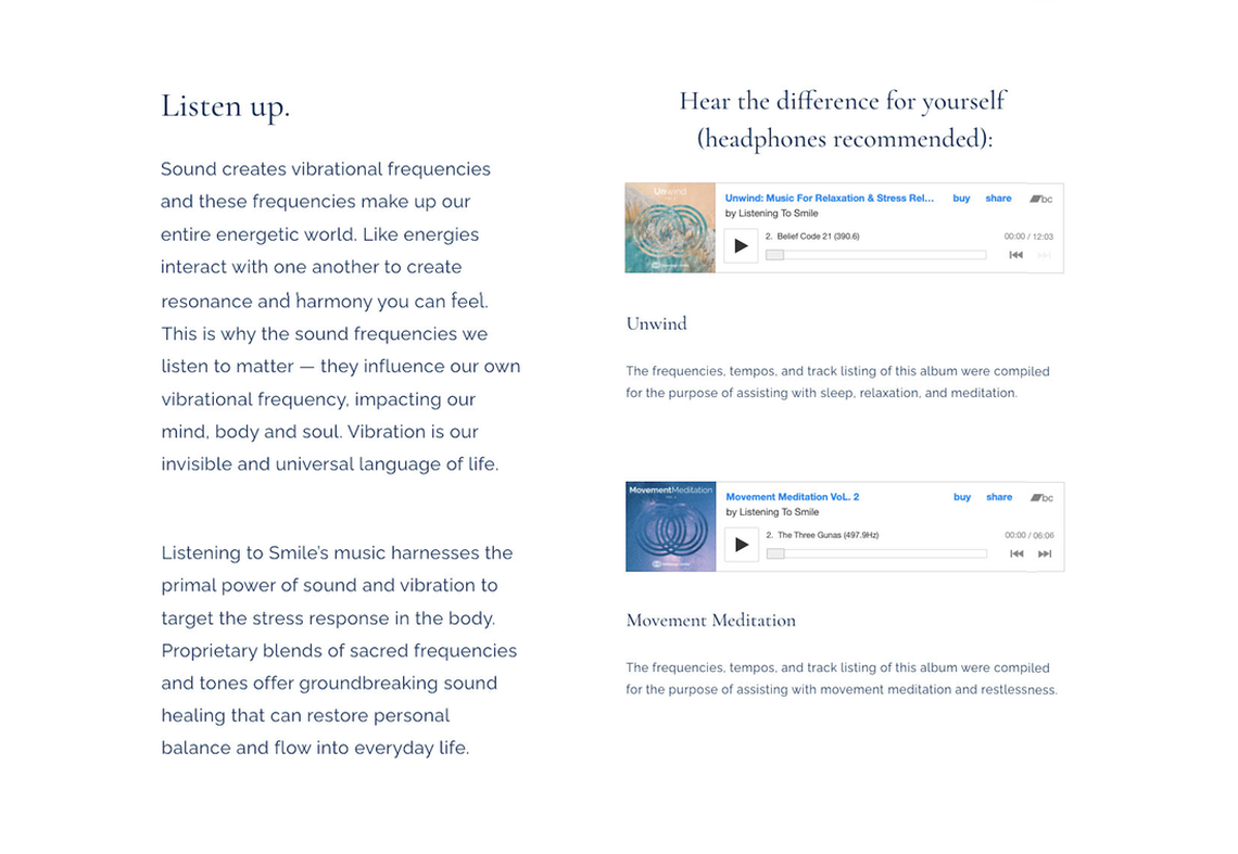
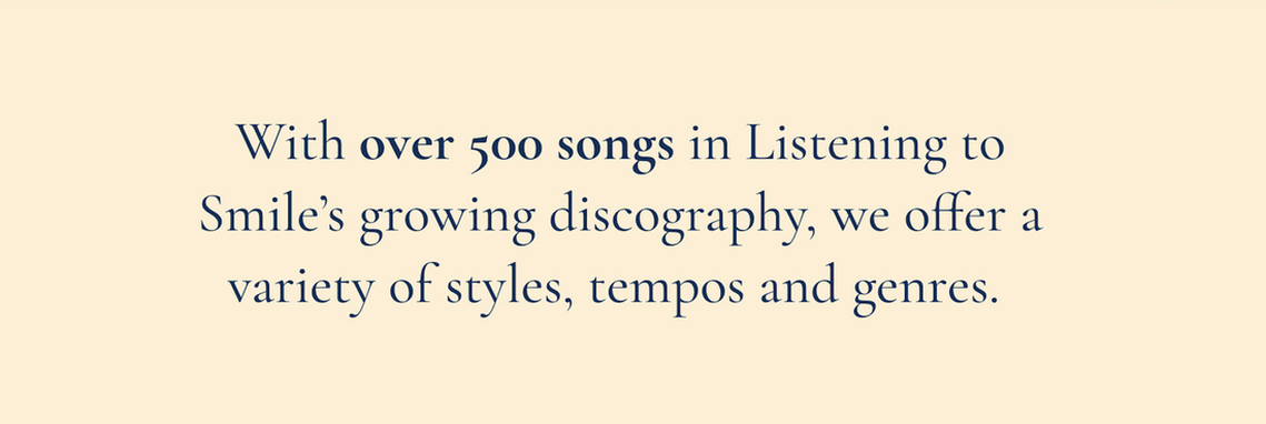
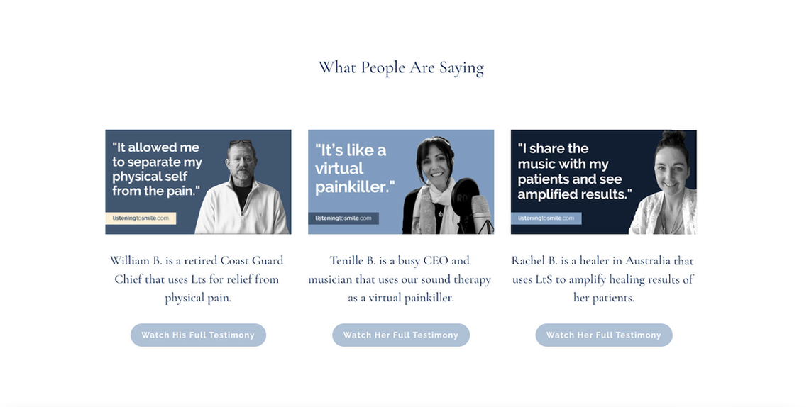
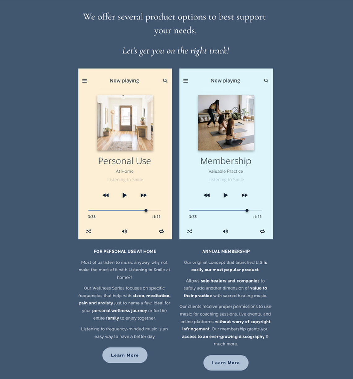
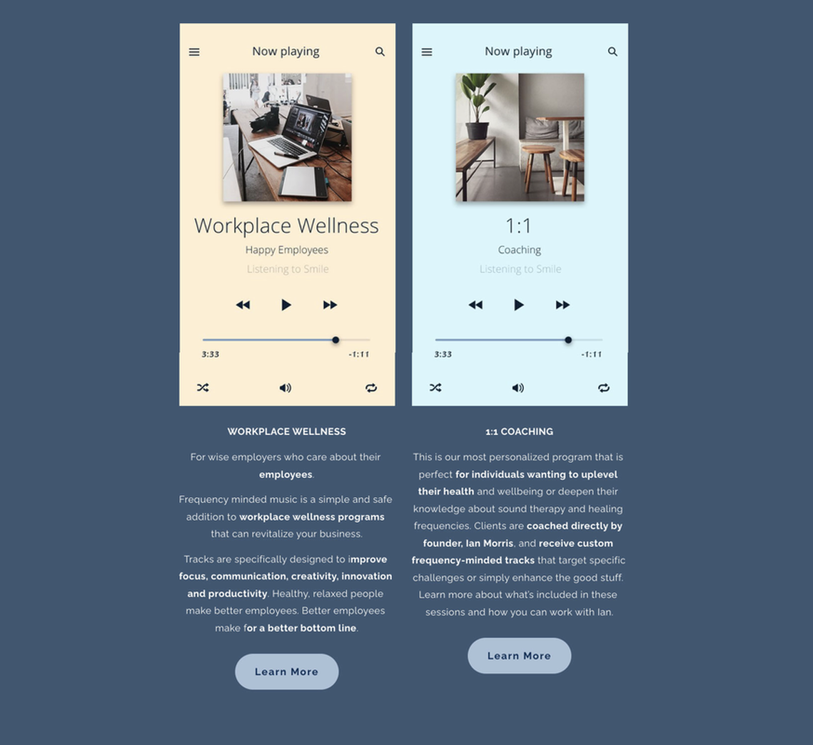
Website Redesign
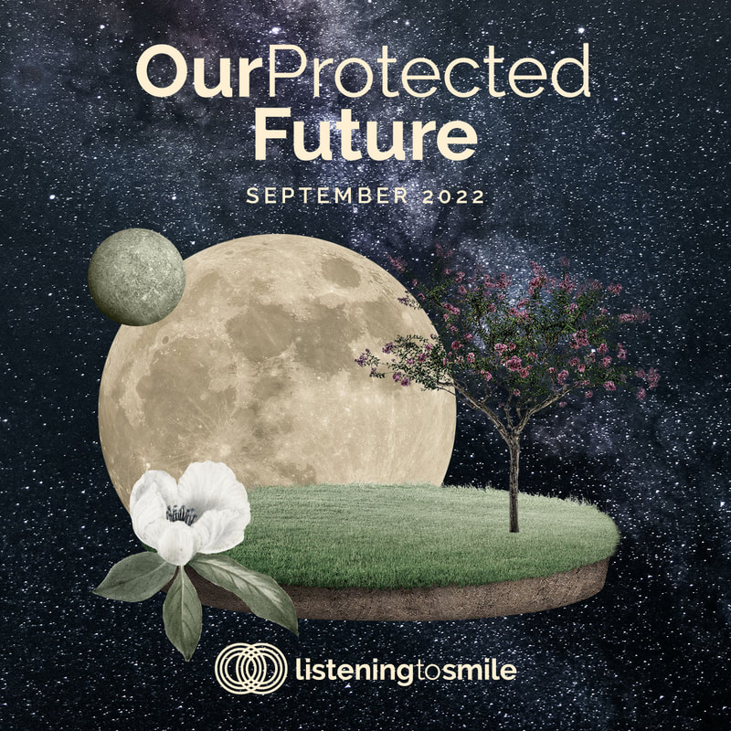
Album Cover Redesign
The Bandcamp albums are available to the public for personal use. I created a template for them that features the logo icon.
Membership AlbumsThese albums are released only to Listening to Smile members. Each month they receive an album created specifically for the astrological themes of the month. For these albums, I created a design pattern that is more in-depth and depicts the theme through unique collages but keeps the album information organized in the exact same way the Bandcamp albums are, keeping the brand consistent.
|
Video Editing
|
|
|
The Full Homepage
Please note there are small white gaps in between the content blocks. These do not exist on the website.

