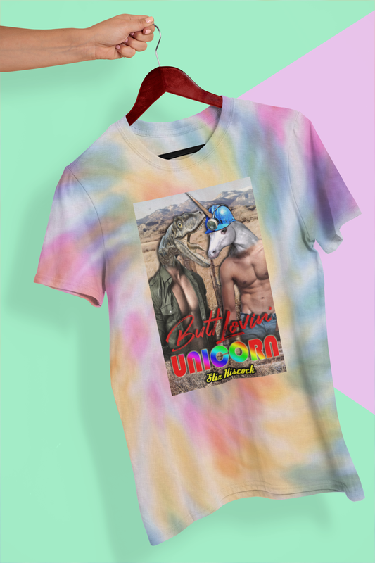
Art is subjective.We all have our own opinions about what is and is not "good'. My favorite art movements are the Dadaist, Constructivist, and Futurist. I'm drawn to art with humor, rawness, chaos, absurdity, and originality. Probably not popular themes in our modern book cover world. So, as I scroll through Lousy Book Covers, sometimes I feel like certain covers are given a bad rap because they have some of my favorite qualities but others just don't see their beauty. Below, in no particular order, is my list of 10 covers that I think are far from lousy.
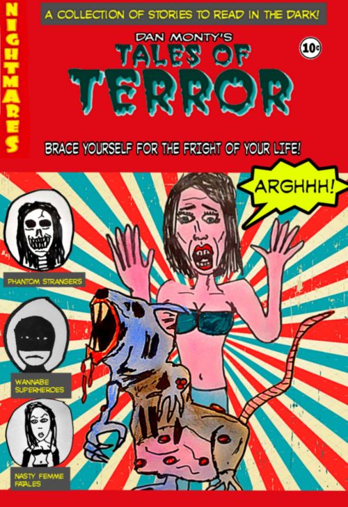
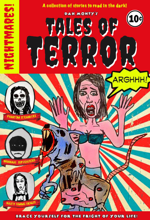
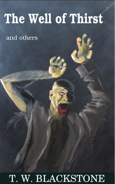
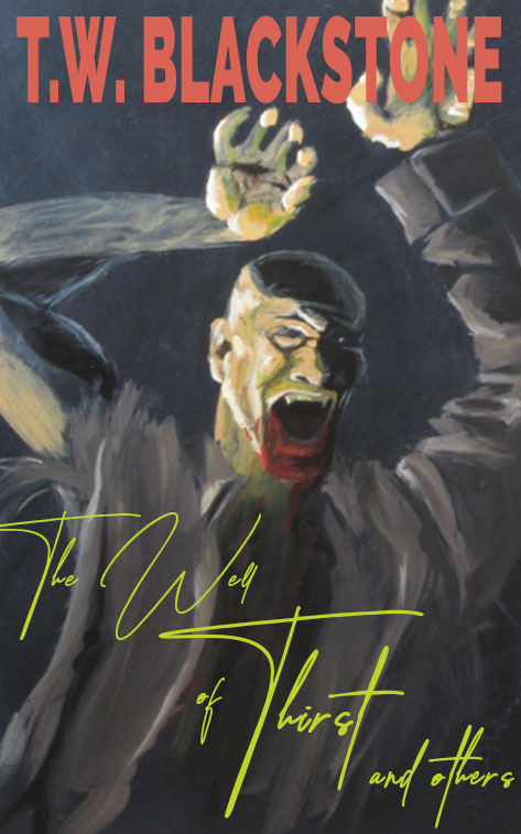
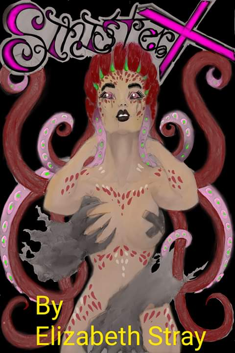
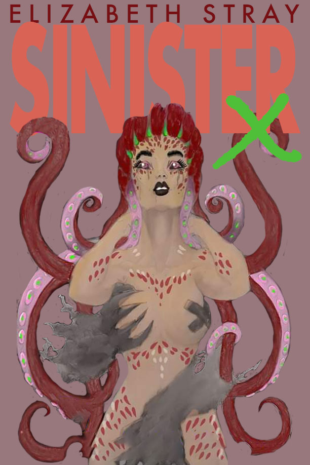
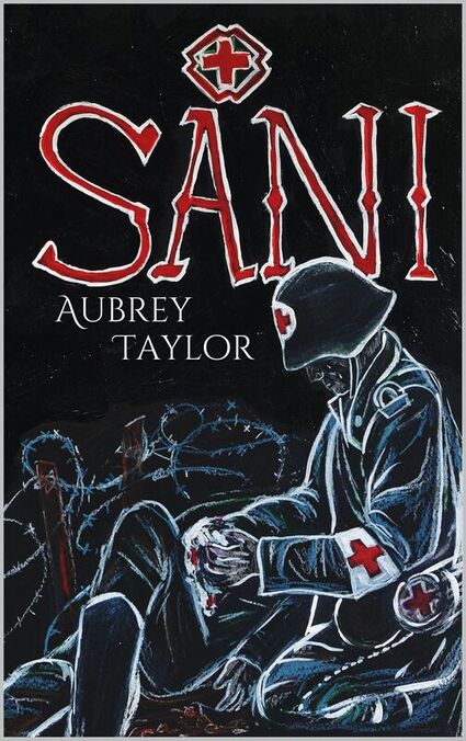
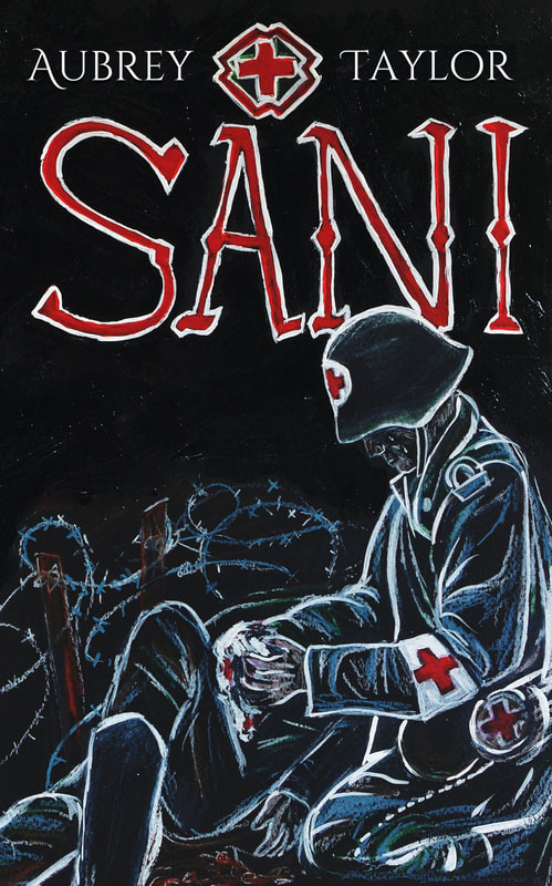
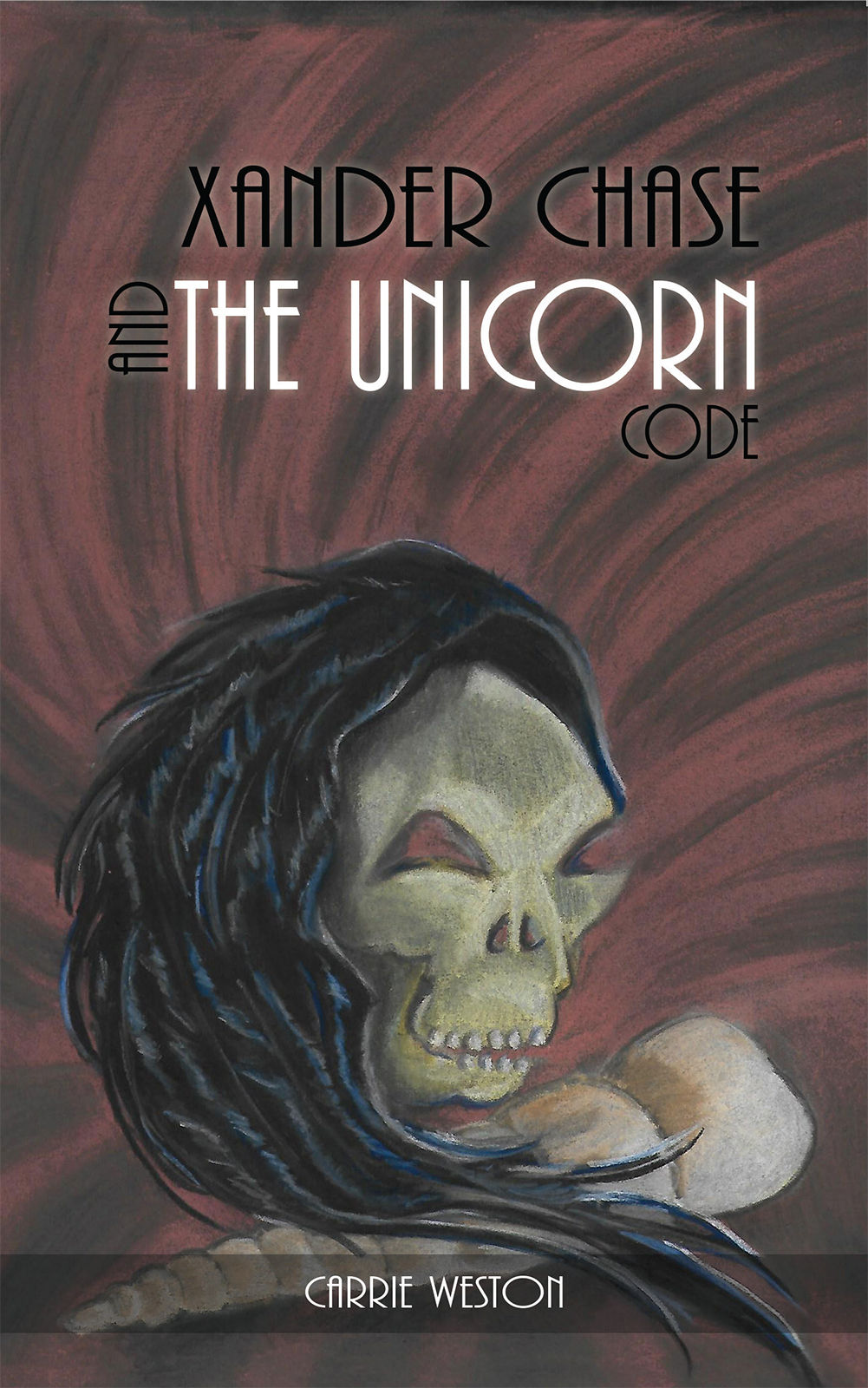
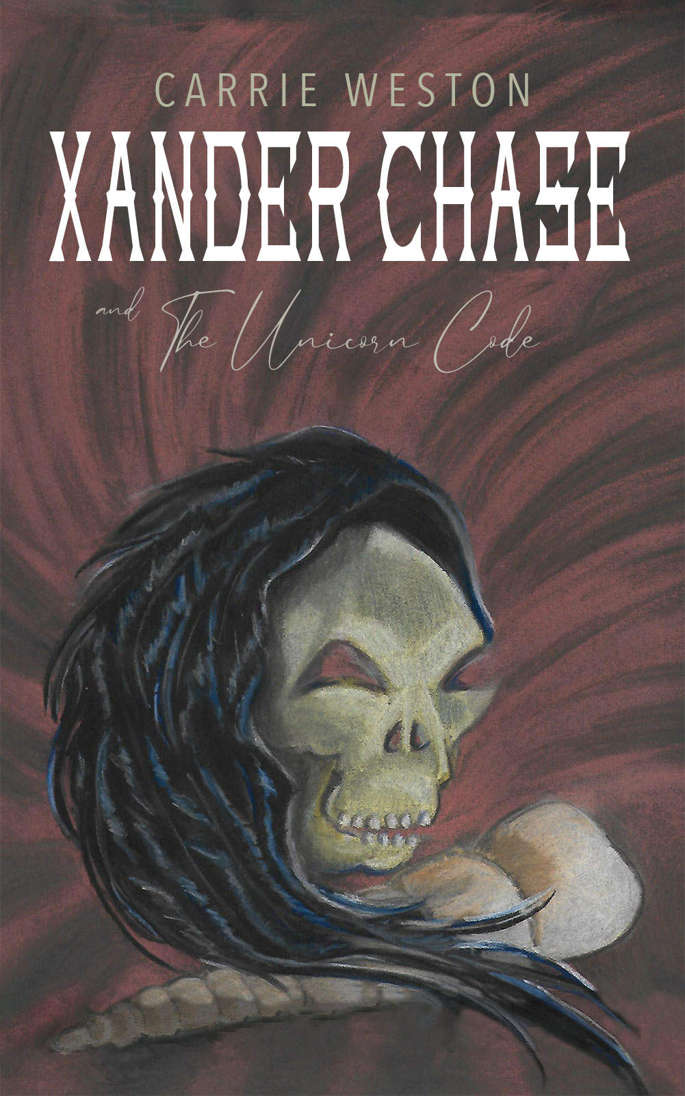
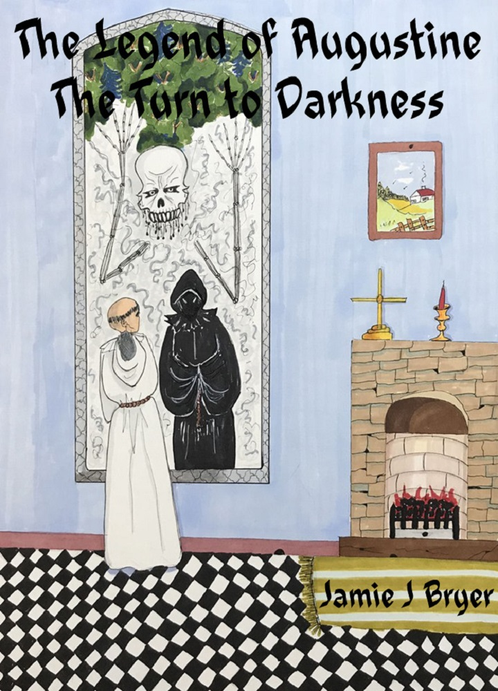
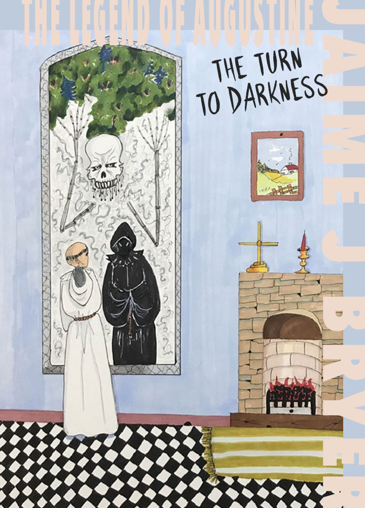
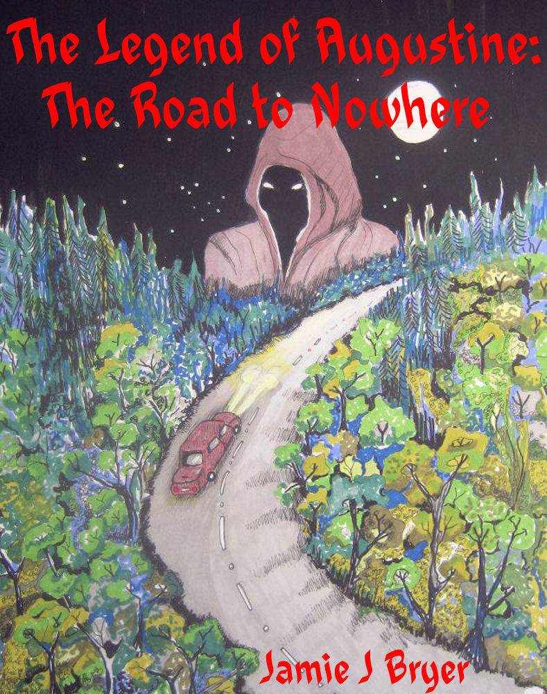
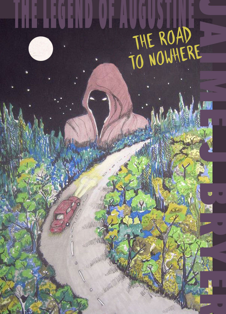
#2 Dan Monty's Tales of TerrorThis cover is so bad ass. I dig the old school horror story book cover style. I love all the hand-drawn elements. The crazy rat and that skull are especially rad. Sure, there are some typography and low-res issues but, overall, I think this cover rocks. I made some quick small changes to the type to show what I'm talking about. Even though I'm not stoked with the side copy listing out "Phantom Strangers" etc, I think what I've done is a bit of an improvement. #3 The Well of Thirst and OthersSure, something's a bit off with the typography but I LOVE this blood thirsty vampire character. It's beautifully painted, emotive, and memorable. I made a version of the cover with some adjustments to the typography. I'm on this kick where I like to make book titles in these wild scripts that can be kind of hard to read. The rawness feels appropriate with the imagery and since these books are digital, you can easily read the name of it on the website. So why not be a bit more loose with the title typography? #4 Sinister XI don't even really know what this octopus-woman thing is but I love it. The use of color is gorgeous and the imagery is interesting. It's giving off a dark sexual vibe that seems fitting with the title of the book. I created a version where I emphasized the color palette and adjusted the type to be more impactful. #5 SaniI really don't get what's lousy about this cover. The hand drawn scene is well-executed, that hand drawn type is killer. The only change I would maybe make is the type setting of the author's name. Like, what not move it up to the top of the cover? And, what a bummer, it looks like the author has already uploaded a new cover for this book. #6 Xander Chase and the Unicorn CodeJust another case of not the best typography paired with really bad-ass artwork. I get it, choosing the right typeface can be such an uphill battle and take a LONG time. So, I'm not surprised when I see cover that needs a bit of type help. And, maybe what I chose for the redesign looks like crap to a lot of you? That's the beauty of design lol! We all see things differently. #7 The Legend of Augustine: The Turn to DarknessI don't know who's drawing these covers but I want to see more. They are pretty damn cool. I even like the hand drawn type but I don't think it's helping in this case. I went a little weird with my redesign on this one and created some color blocking on the top and right side to give a bit more room for the type. Since this is a series, I don't think you need to emphasize the "The Legend of Augustine" part as much as long as all the covers in the series follow this format, people will be able to recognize it. So, with that taking a back seat, the name of this particular book in the series can come forward as well as the awesome artwork. Now, we have a design system that works for this series going forward and you'll see that in the next book listed. #8 The Legend of Augustine: The Road to NowhereSure, the type is intrusive and could be done better but this drawing is so cool! That reaper is a mood. I gave this cover the same treatment as the last because they are part of the same series but updated the color way to fit the artwork.
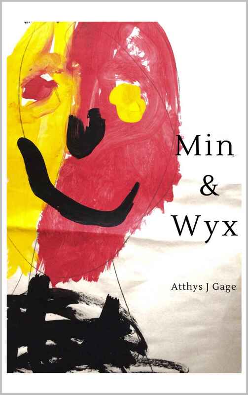
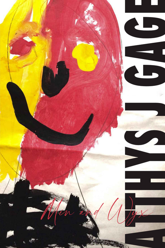
#10 Min & WyxI think a lot of people would scoff at this artwork but I think it's powerful. That divided colorful face, the swishes of black paint that create a neck and torso of a skeleton. Not sure if that was their intention but I see bones and ribs from those broad strokes. The innocent pencil line cutting through underneath it all. There's an energy to this that takes me places. It's deceptive too. It's easy to see this as a kids drawing but, a big part of me doubts a child made this. The only thing lacking was the type, so I made some adjustments. If you're the author of any of these books and what the redesigned cover for free, just message me and I'll email it to you.
Comments
|
Hi, I'm Dana.I love art, design, vintage goods, healthy living, and weirdo fringe stuff.
I design wallpaper and textiles under the name Dolphin & Condor. I have my own line of pillows based on the periodic table called Element Pillows. I have an ugly Christmas sweater shop called My Ugly Sweater. I edit and sell vintage photos under the handle Photo Trade Co. And, so much more! Can you tell I enjoy working? Categories
All
Archives
October 2023
|
